andyps
|
| posted on 16/2/07 at 04:01 PM |

|
|
quote:
Originally posted by stevebubs
http://www.thekitcarworkshop.co.uk/page31.html
That is a good looking "thought for the future"
Trouble is, whenever I see things like this I can't help feeling that they are unlikely to be Locost
[Edited on 16/2/07 by andyps]
Andy
An expert is someone who knows more and more about less and less
|
|
|
|
|
stevebubs
|
| posted on 16/2/07 at 04:52 PM |

|
|
Yeah...Martin was struggling to find the business justification. Even more so now, I should imagine.
|
|
|
Gaz 1977
|
| posted on 16/2/07 at 07:04 PM |

|
|
quote:
Originally posted by macnab
Hmm, not ugly but I'd do a few changes
1) windscreen min 1/4 longer
If it was 1/4 longer it would be below the steering wheel and through the scuttle, so this is not physically possible.
2) Reduce front pillar thickness, a lot
It does need to be thinner but it will be made of fibreglass and it needs to be strong.
3) Include a Diablo cutout to the lower front door window line to improve visibility.
A Diablo is flat sided, this is not so it wouldn't work.
4) Make the bonnet more pointed, looks like a big tongue in the last pic.
This is going to be changed anyway, I have never been happy with it.
5) In one of the drawings the rear area was much smaller and lighter, that I liked a lot the model looks very fat from behind
I have just filled the whole of the back in to start again as I was not happy with it.
6) Front lights look to hidden for the SVA, I was wondering where they even were till I saw the front view.
The Aero 8 gets away with it! But again these will probably change.
7) The doors are going to be very thick, doubt they will hinge out, gullwings might end up very heavy with such a large lower door. Maclaren butterfly
hinges might be the solution.
The doors are explained better earlier in this thread, with pictures.
Thanks for the comments.
|
|
|
Gaz 1977
|
| posted on 16/2/07 at 07:10 PM |

|
|
quote:
Originally posted by Tralfaz
I think you could raise the roofline slightly and thereby extend the windscreen/sidewindows a bit without detracting from the shape.
Brian
Image deleted by owner
Thanks for the image, the height of the model is quite deceptive in the photographs. Just to check it out I've just been in the garage and sat in
my Dad's (907) locost and the top of the roof is the same height as his roll bar which gives a clear four inches over my head. That's with
Cobra seats mounted two inches from the floor and I'm six foot tall. I'm going to mock up a roofline for a photo tomorrow.
Please keep the comments coming.
Thanks a lot,
Gaz
|
|
|
Uphill Racer
|
| posted on 16/2/07 at 07:35 PM |

|
|
Sorry Rob,
I 'm not sure how that vortex formation would block flow out of the wheelarch though - isn't it too low and further inboard?. Can you give
a bit more detail?
My mistake, thought engine bay was exhausted from bottom of scallop behind wheel arch.
|
|
|
Tralfaz
|
| posted on 16/2/07 at 08:24 PM |

|
|
quote:
Originally posted by Gaz 1977
quote:
Originally posted by Tralfaz
I think you could raise the roofline slightly and thereby extend the windscreen/sidewindows a bit without detracting from the shape.
Brian
Image deleted by owner
Thanks for the image, the height of the model is quite deceptive in the photographs. Just to check it out I've just been in the garage and sat in
my Dad's (907) locost and the top of the roof is the same height as his roll bar which gives a clear four inches over my head. That's with
Cobra seats mounted two inches from the floor and I'm six foot tall. I'm going to mock up a roofline for a photo tomorrow.
Please keep the comments coming.
Thanks a lot,
Gaz
Hey Gaz,
My suggestion for raising the roof was less about head room and more about improving view and sight lines, and honestly the windows feel a little
small proportionately to the rest of the car. From the sides the model doesn't look bad, but from the front the 'cockpit bubble' feels
undersized.
Kind Regards,
Brian
|
|
|
Gaz 1977
|
| posted on 17/2/07 at 09:07 AM |

|
|
locost design
hi brian, thanks for the comments.
what i could do is lower the side windows and the shoulder line a little which would enlarge the rear arch.
we are going to get the locost out the garage and have another measure this morning.
i need to come up with a better way of photographing the thing. The mottled matt finish hides the form, For example there is a huge bonnet bulge which
never shows up.
Do you think if i sprayed it with water to get a shine the photos might work better?
thanks again.
Gaz 
[Edited on 17/2/07 by Gaz 1977]
|
|
|
Gaz 1977
|
| posted on 17/2/07 at 02:17 PM |

|
|
locost design
we have had a play in the garage and mocked the roof line the same height as the model but with the front a little heigher. 44 inches at the back
and 42 at the front
 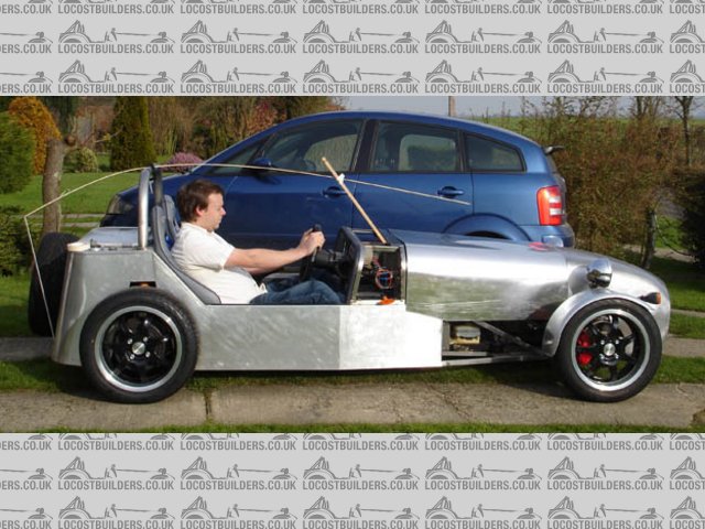
Rescued attachment roof side.jpg
|
|
|
Gaz 1977
|
| posted on 17/2/07 at 02:18 PM |

|
|
locost design
and from the front. 
 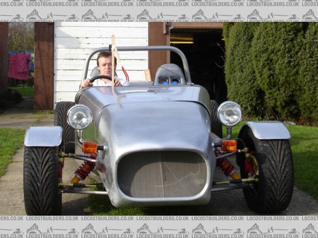
Rescued attachment sutol roof ft.jpg
|
|
|
Gaz 1977
|
| posted on 17/2/07 at 02:20 PM |

|
|
locost design
and from the head rest.
the scuttle on the car in the pic is the same height on my model.
thanks for the help
Gaz. 
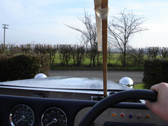 
Rescued attachment roof view.jpg
|
|
|
escort_innit
|
| posted on 17/2/07 at 02:59 PM |

|
|
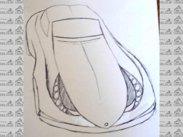
If those are the headlights marked on in black tape I'm not sure I like them, the two very similar shapes look too fussy. Perhaps you could
arrange the lightclusters around the airvents?
I did a couple of sketches to show what I mean;
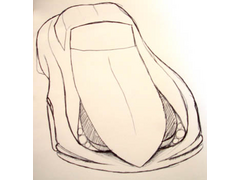 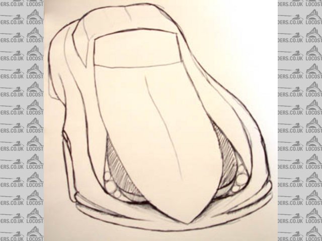
Rescued attachment DSC00617.jpg
|
|
|
escort_innit
|
| posted on 17/2/07 at 03:00 PM |

|
|
Or this;
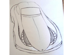 
Rescued attachment DSC00616.jpg
|
|
|
Gaz 1977
|
| posted on 17/2/07 at 06:13 PM |

|
|
locost design
nice idea
|
|
|
Gaz 1977
|
| posted on 17/2/07 at 07:54 PM |

|
|
locost design
I have just read my last reply and it looks like it could be misinterpreted as taking the piss, so sorry for that, I do really like the idea of the
lights where you have put them and i will definitely try them on the model.
thanks for everyone's responses
Gaz
|
|
|
escort_innit
|
| posted on 18/2/07 at 09:46 AM |

|
|
I didn't take it as offensive, but apology accepted anyway! 
|
|
|
chrisg
|
| posted on 19/2/07 at 02:50 PM |

|
|
I've been thinking Gaz (dangerous I know) but because of the need to retain the high sill (side) of a Locost wouldn't a pop canopy like
the Nova work?

No messing with butterfly doors or gull wings, simple and easy.
Just a thought.
Chris
Apparently Uroglass do the screens too!
[Edited on 19/2/07 by chrisg]
|
|
|
Fred W B
|
| posted on 19/2/07 at 05:36 PM |

|
|
But, how do you get out of the car if it happens to be upside down?
Cheers
Fred W B
|
|
|
Gaz 1977
|
| posted on 19/2/07 at 06:32 PM |

|
|
locost design
hi chaps.
To answer fred, A door in the floor. (your last name isn't Flintstone is it)
The nova roof could be a bloody good idea.
I still fancy a removable hard top so what if the front screen stayed in place and the rest moved up and backwards?
On the screen front, i had a look at a smart roadster in a car park and it might well nearly fit. I know a guy a uni with one so i will give it a
measure in the week.
the rear screen is not so much of a problem but how about using the new vauxhall tigra?
I will .be back working on the model tomorow and i will se if i can come up with a front end.
Thanks.
Gaz
|
|
|
Gaz 1977
|
| posted on 20/2/07 at 06:22 PM |

|
|
locost design
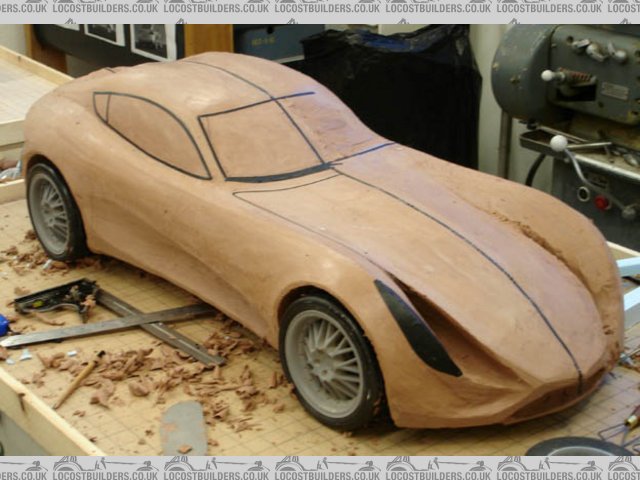
here are the latest images,
Rescued attachment feb 20 s34.jpg
|
|
|
Gaz 1977
|
| posted on 20/2/07 at 06:23 PM |

|
|
locost design
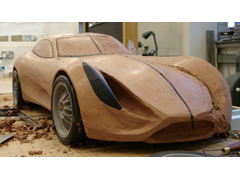
and another
 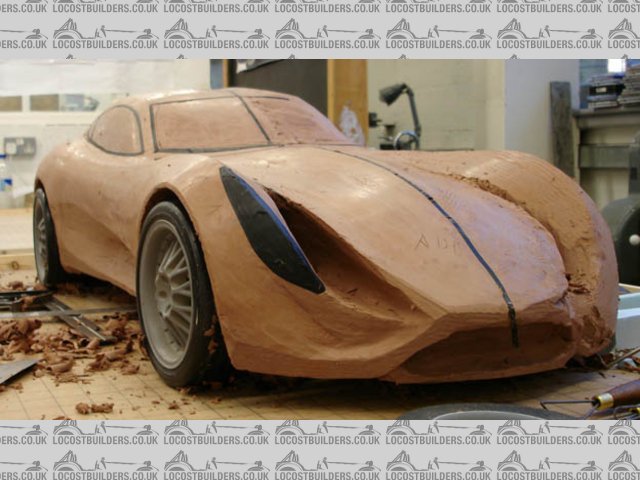
Rescued attachment feb 20 ft34.jpg
|
|
|
Gaz 1977
|
| posted on 20/2/07 at 06:26 PM |

|
|
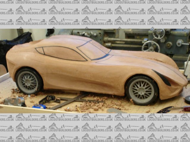
locost design
and one more.
all comments would be greatfully recieved
thanks
GAZ
Rescued attachment 20 feb side.jpg
|
|
|
Tralfaz
|
| posted on 20/2/07 at 10:15 PM |

|
|


|
|
|
macnab
|
| posted on 21/2/07 at 12:30 PM |

|
|
10/10, well done
|
|
|
gottabedone
|
| posted on 21/2/07 at 04:54 PM |

|
|
nice work
Gaz
Very nice work. Your initial designs were very nice but progressive works seem to water down what you initially intended. We all have our own views
on design which are influienced by our favourite cars. Other peoples views are steering your design towards TVR/Marcos/Melling etc.
Your idea for the sculpted sides has raised many a readers eyebrows. There has been a lot of chat about aero dynamics but how efficient a shape is the
7 - not at all. The sides are one of the main features of your first drawings and IMO helped to lessen the impression of the height of the car.
Your design is wicked and I think that you should model the car the way you intended - with a few modifications of course.
keep up the good work - does this pikky (hope it works!!) of the saab aero x get you thinking about your roof????
regards
Steve
|
|
|
gottabedone
|
| posted on 21/2/07 at 04:59 PM |

|
|
OOPS!!!!
I've put the image of the saab in my photo archive
regards
Steve
|
|
|


