Pdlewis
|
| posted on 21/10/06 at 01:15 PM |

|
|
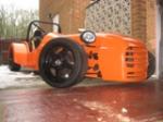
Colour Choices
Its come to the time when the old gal needs a bit of a colour refresh!!
Got the labour for free so only need to buy the paint im just unsure are to the colour. My initial choice was orange but dont know weather it would
work with the stainless? or should stick with the black
If anyone has any other suggestions they will be much appriceated
Cheers
Paul
(car pics in archive and avatar)
|
|
|
|
|
StevieB
|
| posted on 21/10/06 at 01:29 PM |
|
|
Go traditional - BRG arches, yellow nose. Timeless
|
|
|
rayward
|
| posted on 21/10/06 at 01:38 PM |
|
|
yellow would work well with the stainless.
Ray
|
|
|
stevec
|
| posted on 21/10/06 at 03:08 PM |
|
|
BRG For me too.
Steve.
|
|
|
robertst
|
| posted on 21/10/06 at 03:22 PM |
|
|
a while ago i messed around with photoshop to decide on the colour
hope these help u decide.
i got the pic from google..sorry if its someones...
my favourite: Red with silver:
 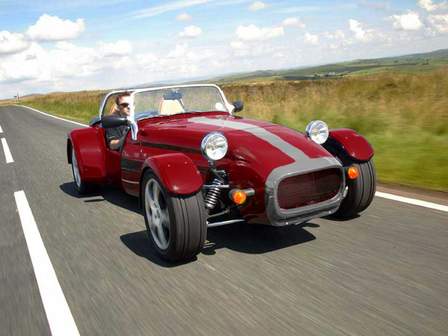
testing for colours RED
BRG and Yellow cone:
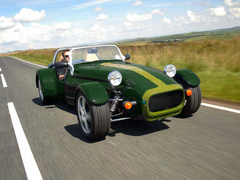 
testing for colours BRG
Orange with black:
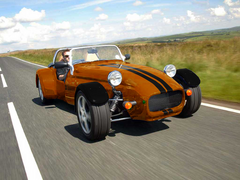 
testing for colours ORANGE
Blue with white/silver stripes:
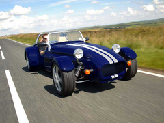 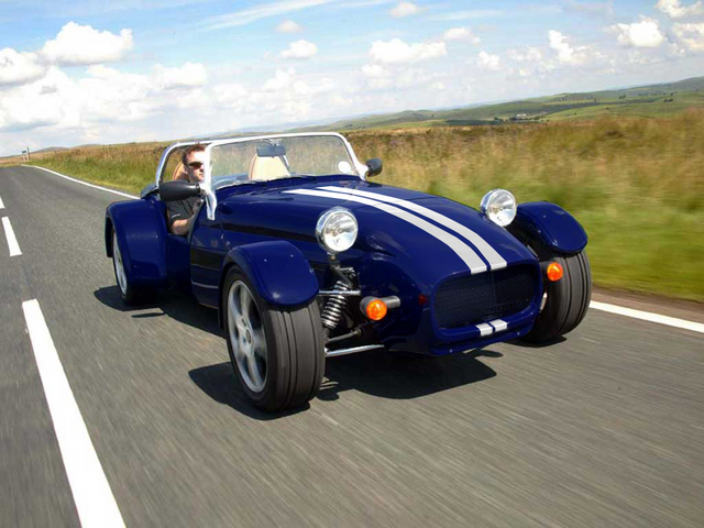
Testing for colours BLUE
Tom
|
|
|
Pdlewis
|
| posted on 21/10/06 at 03:49 PM |
|
|
What colour did you go for? the blue looks sweet 
|
|
|
JackNco
|
| posted on 21/10/06 at 04:53 PM |
|
|
Tom the picture belongs to Westfield. used to be on there gallery but its gone. but im sure they wouldn't mind u using it as its basically
advertising!
and sticking to the thread
Black n stainless always looks good. as does yellow and black trim with stainless.
But if u have free labor y not shell out a bit n get a nice metallic colour or even pearlessent?
John
Some people are worried about the difference between right and wrong. I'm worried about the difference between wrong and fun.
O'Rourke, P.J. (1989), Holidays in hell. London (Picador)
|
|
|
JackNco
|
| posted on 21/10/06 at 04:56 PM |
|
|
oh and if u go stripes, dont do straight stripes, they look to thin, most cars that have stripes on actually get thicker towards the middle of the
car!
have a look some cars look just right and some look like the stripes look off some how but you wont be able to place why. about a quarter of an inch
thicker at the back of the bonnet and it looks all the better
John
Some people are worried about the difference between right and wrong. I'm worried about the difference between wrong and fun.
O'Rourke, P.J. (1989), Holidays in hell. London (Picador)
|
|
|
robertst
|
| posted on 21/10/06 at 05:06 PM |
|
|
i decided on the red with silver stripe looks great..
i have to admit i also decided on this colour upon seeing a C****ham ad it just looked beautiful... it just looked beautiful...
didnt think about the stripe width though... i'll take a look... thanks for the advice..
Tom
|
|
|
triumphdave
|
| posted on 21/10/06 at 05:37 PM |
|
|
quote:
Originally posted by robertst
i decided on the red with silver stripe looks great..
i have to admit i also decided on this colour upon seeing a C****ham ad it just looked beautiful...
didnt think about the stripe width though... i'll take a look... thanks for the advice..
Does that mean you are going to paint the stainless know?
If you always do what you have always done you will always get what you have always got
|
|
|
StevieB
|
| posted on 21/10/06 at 06:43 PM |
|
|
I once saw a Caterham that had the ali body with metallic red wings and nose - a sort of oxblood colour. Looked really special and when I get my
Caterham one day (I don't care what anyone says - I'm getting one!) it will be a coin toss between that and BRG/yellow
|
|
|
JackNco
|
| posted on 21/10/06 at 06:46 PM |
|
|
i never got the apeal of Caterham. they are the most plaine looking 7s, and surely the metal mody slows them down a bit? plus if u budget that much
why not get a nice westy n spend the excese on engine mods?
Some people are worried about the difference between right and wrong. I'm worried about the difference between wrong and fun.
O'Rourke, P.J. (1989), Holidays in hell. London (Picador)
|
|
|
StevenB
|
| posted on 21/10/06 at 06:52 PM |
|
|
I picked mine from here. I changed my mind about 5 times after seeing the RAL chart.
http://www.e-paint.co.uk/Colourchart.asp?pType=&pFinish=
Hope the address works ok.
s
*
|
|
|
StevieB
|
| posted on 21/10/06 at 06:56 PM |
|
|
The Caterham had better proportions IMO, and a lower line than the rest. The simplicity is exactly as Colin Chapman designed it - fast because
it's minnimalist and not fussy.
Westy's look fat to me - the fold along the bonnet side, taller at the bonnet than a Caterham, longer, too much fuss.
I'm a purist.
In all honesty, I'll probably try to do the next car as a locost, but modify the design to try and mimic the Caterham proportions.
And as much as I like the BEC side of things, somehow having a crossflow running proper carbs is appealing.
I can't explain why without a long discussion though.
|
|
|
JackNco
|
| posted on 21/10/06 at 06:57 PM |
|
|
thats exactly why i like the westfield i looks more chunky and complicated
Some people are worried about the difference between right and wrong. I'm worried about the difference between wrong and fun.
O'Rourke, P.J. (1989), Holidays in hell. London (Picador)
|
|
|
miserableoldgit
|
| posted on 21/10/06 at 11:34 PM |
|
|
Colour Choice
Be a Devil and go for an original.
Barbie Pink
Youth and vitality are wasted on the young
|
|
|
02GF74
|
| posted on 23/10/06 at 09:34 AM |
|
|
I'd stick to black or have you consider 2 tone flip paint (e.g. orange/green)
What about a metllic bronze colour?
|
|
|