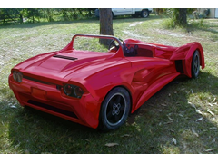
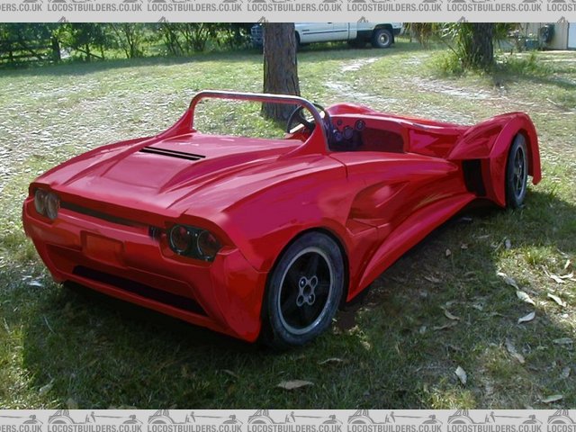
I personally would also go with the #1 side intakes, but with #2's front fenders.
here:


Rescued attachment Image2.jpg

Opinions on these two rear ends are sought...
http://www.desicodesign.com/meerkat/Bodywork%203.htm
The first is very aggressive and the second one a little simpler
Cheers,
Alan
1st one.
Not sure why, I just like it.
I like the recessed look of #1 with the top of the lid, and bottom valance of the #2 pic.
I personally would also go with the #1 side intakes, but with #2's front fenders.
here:


Rescued attachment Image2.jpg
Oh Alan, I'm going to have to be very blunt here!
#1 Looks very home made, and badly, at that. It looks like the rear deck vents have been salvaged from cars unknown, and grafted on in attempt to
solve some post production cooling issues.
As for the front arches/guards...I'm not even going to attempt to express myself.
#2 looks the biz.....except the rear "grill" and lights are reminiscent of Jaguar XJ/Aston Martin/Cortina Mk 5. I still prefer it though to
the Corvette looking blank rear panel/bumper.
To be honest, I think Matt has hit the nail on the head. Very tasty looking car.
![]()
The more I see it the more I dislike that rollbar however... I think It needs to be thickened a bit so that it looks more elise ish.
Could change my mind if it had a little color though.
Hmmm!
Decisions, decisions!
I love the rear end of no1, but am not sure if it goes with the overall retro style of the car.
If it had been fully encolsed at the front as well, I would definately say go for number 1.
As it is I would say stay with your original rear end.
Too much detail at the back will make the rest look unfinished or odd! 
I also have experimented with the pictures and these convinced me that I think you should stick with the old rear end.
I don't like the front on image one at all and mixing no1 rear with no2 front makes it look like two cars stuck together.
All just my very humble opinion of coarse!
Terry


[Edited on 9/8/03 by Spyderman]
Thanks guys.....to the point as always....and that's what I expect...
I agree in general....I'm favouring the side profile on my avatar with a simplified number 1 rear....not unlike Matt's idea..
Thanks again
i completely agree with matt, as i flicked between them i thought the nice bottom of 2nd and the top of number 1. And he may be right in the roll bar
as well.
id keep the top of number 2 but maybe smooth out the two outside vents? might look nice if the two recessees sweep all the way thru!
gonna have a nuther look and then edit....
yeah, i agree with me- like matts but the top part off the more complex one, 2 vents gone.
ALSO id definitely use the front wheel arches off #2(?) the simpler one, they look more attached to the car, a bit slicker!
All the best anyway, keep us updated!
[Edited on 9/8/03 by JoelP]
Sorry to jump in at this late stage, but I look at rearend 1 and the first thing that smacks me in the face is ... Its a consul capri front end after
a 70's customizer has finished with it! Go on, look again and squint a bit, it is isnt it? 
Just to be odd, I like the clean lines of rear2 more along with number 2 front wings, like someone else said, they look more "designed" than
tacked on....
And one last comment, its starting to look a bit... bulbous round the rear end, like the back bits the gubbins universal cover, and the front only has
to cover your feet so is tiny and sort of looks.. unbalanced. Probally just the angle..
Dont mind me, I still like the shape of novas 
and just a note... The side intakes should extend further forward... I didn't see it abruptly ended when I 'chopped it, so in my pic it kind of ends very abruptly.
Another late hit:
I like the recesses around the #1 taillights, too. They give the rear more personality, i.e., a bit less Corvette-ish.
Otherwise, I prefer everything else about the #2 design, vents, fenders, and all. It's a nice, balanced design and really doesn't look like
anything I've ever seen. Great job.
Pete
I going to throw my .000002 cents in here too. I think Matt made a good combo/frankenstein and I have to agree 100% with PeteB regarding not so much
detail required around the rear end.
Graber
Number 2, definately number 2!!
Personally, there's nothing on number 1 that I prefer over 2. Front arches, sides, engine cover and rear all from number 2!!
Number 1 just looks like someone been trying too hard! It all looks quite Nova boy with 50 quid body kit to me!
Bit harsh maybe but obviously all IMHO. Much prefer the clean lines of 2. Hope I've not made my feelings too clear!
Alan,
Don't take this the wrong way... but...
If you put headlights in No.1 instead of the red lights, it would look like the front of a car!
My vote is for No.2.
Cheers,
David