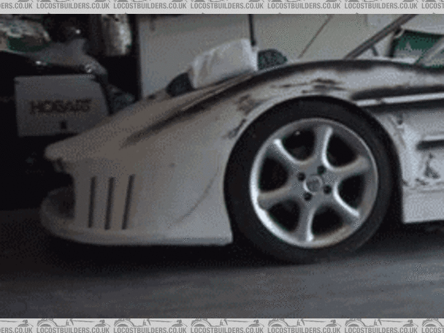
I made another video this weekend...
sgraber - 11/10/04 at 08:21 PM
Don't worry, they're all work safe! 
I uploaded 2 new videos to my site. One shows how I made my DIY LED tail light housings (This may be interesting if you are building a Locost as
well). The other is a current progress walkaround of the car.
Watch from Here
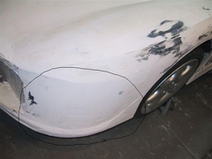
I also spent Sunday afternoon refining the shapes of La Bala ... Lots of sanding, not too much visual wow for the hours thought. A careful look will
show that the front fender arch towards the windshield is more refined. I used masking tape to define my edges and the spray black over it. Then I can
sand the shape and still see my defined edges. Afterwards I removed the tape. As seen in this photo.

No diary entry as of yet. Maybe tonite if I find the time.
Graber out.
I love speed :-P - 11/10/04 at 08:25 PM
looking good


robinbastd - 11/10/04 at 09:27 PM
Fantastic.
Ian
Hellfire - 11/10/04 at 10:27 PM
Very nice - like the rear lights Steve...
Keep it up...!
ATB
Sven - 12/10/04 at 05:01 AM
Awesome, Steve ... I've recently been looking at truck LED lights myself for tail lights for my car. This video will come in handy, thanks.
-Steve
David Jenkins - 12/10/04 at 07:50 AM
Steve,
That's looking really smart!
Can I make one comment? Not trying to be picky or bad-mouthing, honest 
You have a couple of really sharp lines coming up from the front wings and along the top of the sides. Nothing wrong with this, and it looks good -
but your GRP moulding had better be spot-on, otherwise the slightest ripple or warp is going to stand out vividly.
Mind you, if you get it right it'll look superb!
Well done...
David
derf - 12/10/04 at 12:51 PM
Beautiful, kinda a nice paint design too.
sgraber - 12/10/04 at 01:57 PM
quote:
Originally posted by David Jenkins
Steve,
That's looking really smart!
Can I make one comment? Not trying to be picky or bad-mouthing, honest 
You have a couple of really sharp lines coming up from the front wings and along the top of the sides. Nothing wrong with this, and it looks good -
but your GRP moulding had better be spot-on, otherwise the slightest ripple or warp is going to stand out vividly.
Mind you, if you get it right it'll look superb!
Well done...
David
Hi David,
The lines are sharp like that so I can more easily transfer the dimensions to the other side. After a while I will knock them down and round them out.
Some significantly.
There is still time to be picky, I have redone these panels 3-4 times already, trying to find that o-so right shape. It later that I hope people
don't start to make the negative comments... 
David Jenkins - 12/10/04 at 02:23 PM
quote:
Originally posted by sgraber
The lines are sharp like that so I can more easily transfer the dimensions to the other side. After a while I will knock them down and round them out.
Some significantly.
Now that sounds interesting! Slightly rounded in some places, more rounded in others... could look very sexy! 
rgds,
David
derf - 12/10/04 at 05:37 PM
Dumb question, but are you going to have a clear reverse light?
sgraber - 12/10/04 at 05:52 PM
quote:
Originally posted by derf
Dumb question, but are you going to have a clear reverse light?
Not a dumb question at all. Hadn't thought too much about it. How about a flashlight in the cockpit? 
Or better yet, a small powerful 12v halogen light concealed behind the rear grill. It could be on a switch and used to blind tailgaters! 
Spyderman - 13/10/04 at 11:28 AM
Steve, it is looking fabulous!
You really are getting on well with it.
Praises over, now for the constructive criticizm! 
The only two points I can find questionable are;
1, the rear deck area overall looks great, but the sharp drop from the wings/fenders looks out of place. I know you have said that the sharp edges
will be rounded down later, but it is the vertical drop that I think is out of place. Maybe a slight angle of about 15 degrees off vertical might be
better. Overall I like the lowered deck.
2, The sides and rear profiles are all vertical, but the front is angled out to lower lip. This by itself is fine, but it is the transition stage in
front of front wheels that looks odd. I know it will be very difficult to remedy this area, but if you could maybe build out the front a little more
and make the top and bottom radii the same, just shifted back at top, it will help. Not a very clear picture I know, but I can't think how else
to describe it!
Overall brilliant!

Terry
sgraber - 13/10/04 at 02:57 PM
quote:
Originally posted by Spyderman
Steve, it is looking fabulous!
You really are getting on well with it.
Praises over, now for the constructive criticizm! 
The only two points I can find questionable are;
1, the rear deck area overall looks great, but the sharp drop from the wings/fenders looks out of place. I know you have said that the sharp edges
will be rounded down later, but it is the vertical drop that I think is out of place. Maybe a slight angle of about 15 degrees off vertical might be
better. Overall I like the lowered deck.
2, The sides and rear profiles are all vertical, but the front is angled out to lower lip. This by itself is fine, but it is the transition stage in
front of front wheels that looks odd. I know it will be very difficult to remedy this area, but if you could maybe build out the front a little more
and make the top and bottom radii the same, just shifted back at top, it will help. Not a very clear picture I know, but I can't think how else
to describe it!
Overall brilliant!

Terry
Dear Terry, thank you for pointing these areas out. Maybe it's a matter of not being able to see the angles and curves in the photos. But I
think that both areas you mention have quite a bit of both. Here is a supporting photo.

Are we talking about different things? In this photo you can see that the rear fender is a discrete unit that flows from rear of car to the front of
the windshield. What is not evident here is how much angularity from vertical occurs where the top merges with the sides.  But maybe I didn't
understand a thing you said?
David Jenkins - 13/10/04 at 03:03 PM
Now that I've seen that picture I'm happy to withdraw what I said! 
I can see that with a bit of smoothing & rounding that it'll look just fine.
When do you think you'll be far enough down the line to make a GRP mould from the plug?
rgds,
David
Spyderman - 13/10/04 at 11:47 PM
"Dear"?
I know I'm getting old, but I'm not a dear yet! 

Yup that image shows it better!
It must have been the paint and lines that gave me the wrong impression! That and the fact I'm colour blind! 

I've just looked at video again and it is the shadow that caused the confusion. Sorry!
That clears up item 1.
Item 2 was at the front of the car.
The front corner!
The lower valance is definately wider than the body in front of front wheels. It has a different radius to the curve below the headlights. This messes
up the whole front look!
Maybe it is bacause it is such a plain area and needs a vent or duct to fill it.
Terry
[Edited on 13/10/04 by Spyderman]

Rescued attachment steve1.JPG
sgraber - 14/10/04 at 12:32 AM
I don't know why I wrote 'dear'. I think it's an Americanism used in letter writing. "Dear Sir," Ahh well, just ignore
me... 
The area you are referring to is one of my recognized problem areas. I am thinking about adding some gills to break up that space, (See photo)


Front valance gills
Cita - 15/10/04 at 06:26 PM
My 2 cent's:
I should use one long grill placed horizontal on each corner.
The corner needs to be curved inwards from just below the horizontal grill.
All IMHO of course
woodster - 18/10/04 at 12:26 PM
enjoyed the videos ............ how about a job on tv
derf - 18/10/04 at 01:10 PM
gills, will it be able to drive under water too?
sgraber - 18/10/04 at 09:55 PM
quote:
Originally posted by woodster
enjoyed the videos ............ how about a job on tv
Should I make more how-to videos? 
Fred - You have to take just one look at the recent crop of supercars to see that gills are 'IN'. 


