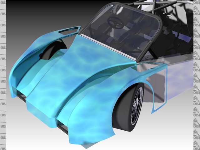
Nose Render.
Doug68 - 15/4/08 at 12:58 AM
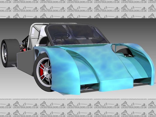
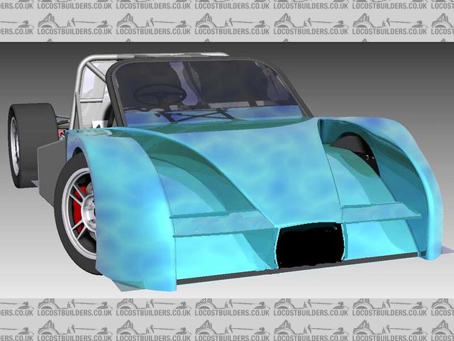
Here's the latest attempt at starting a body for the thing.
This version is a fair bit different from the one shown in avtar, frankly I find doing body design a real PITA and if I could hand it off to someone
who do a good job of it (for free (yeah right)) then I would.
Obviously this isn't finished, particularly there are cut outs missing to let air out from various places.
The rest of my current progress is posted on my web page (see sig)

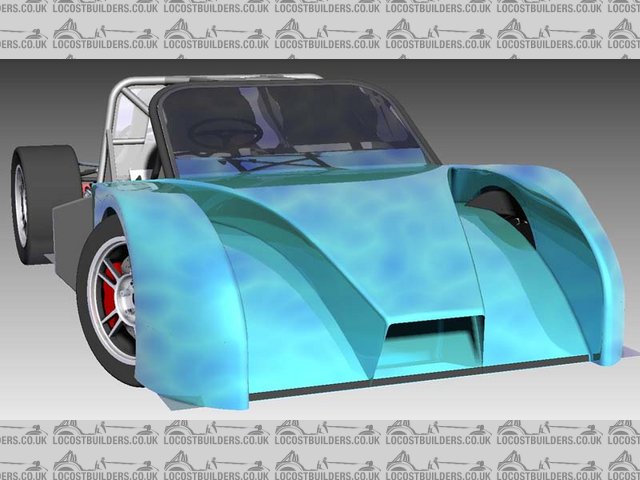
Rescued attachment Copy of test.jpg
liam.mccaffrey - 15/4/08 at 01:02 AM
i like it a lot
Benonymous - 15/4/08 at 03:31 AM
I reckon getting someone else to design your bodywork has "disaster" written all over it! The only way would be to give them carte blanch
over it and not interfere I'd find it impossible to properly convey my ideas on something as subjective as that. It looks like you're
doing a reasonable job anyway. Are you using SW?
BTW is your windscreen going to be flat?
Doug68 - 15/4/08 at 03:34 AM
Windscreen: Yep flat as a pancake or Kansas, which is actually flatter than a pancake.
I'm using Solid Edge BTW.
[Edited on 15/4/08 by Doug68]
Dick Bear - 15/4/08 at 05:34 AM
Doug,
I like it but are you sure it can be made as drawn? I wonder about the width of the "fenders". To me they look too narrow to accommodate
the right/left turning motion of the front wheels. Also I can't tell from the rendering what is happening at the windshield end of the scoops.
Is there a release point for the air flowing up the channels?
I'm sure you have this all worked out but based upon the drawing, I had to ask.
Dick Bear
Doug68 - 15/4/08 at 06:02 AM
Dick,
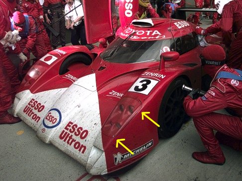
You are quite right the wheels don't fit under the guards when turned. The inner fender will be cut away to allow this and allow air out thats
been forced up the lower 'ramp'.
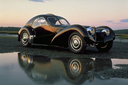
It's meat to be similar to this:
It's by no means finished yet, I'm probably only really about 30% through the work this part will need. If I don't throw it away and
start again for the umpteenth time.
Delinquent - 15/4/08 at 08:49 AM
It's a hell of an improvement over the one in the av' - would certainly take this one further. I do like the wheel cut outs, not like
anything else I've seen on the road.
I'd drop the height of the nose cone section a tad personally. It's going to be interesting to see how you incorporate this with the rear
end!
ETA - know what you mean about the bodywork - the pic in my AV <---- is something like revision 34 (can't remember exact number) and if
I'm honest, the last few nights I've been working on v.35 (got a new wacom tablet and couldn't think of what to play with it on....
oops)
[Edited on 15/4/08 by Delinquent]
Alan B - 15/4/08 at 11:15 AM
I did the exposed wheels look early on in my Meerkat development....I liked it at the time..not sure why I changed it...
Alan
[img][/img]
Schrodinger - 15/4/08 at 04:40 PM
I like the look of the front a lot but what about lights?
Doug68 - 15/4/08 at 11:41 PM
quote:
Originally posted by Doug68
It's by no means finished yet, I'm probably only really about 30% through the work this part will need.
StuartBJ - 16/4/08 at 06:17 PM
Who builds this kind of thing/nosecone? I need one 
ANDYSHORT - 16/4/08 at 09:40 PM
what about modifying an existing available body?.jpg)
FUORISERIE - 19/4/08 at 09:42 PM
quote:
Originally posted by Doug68
Here's the latest attempt at starting a body for the thing.
This version is a fair bit different from the one shown in avtar, frankly I find doing body design a real PITA and if I could hand it off to someone
who do a good job of it (for free (yeah right)) then I would.
Obviously this isn't finished, particularly there are cut outs missing to let air out from various places.
The rest of my current progress is posted on my web page (see sig)
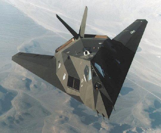
have you thought about changing the front screen? how about a Stratos replica screen, it would almost matche the GTP look you're trying to work
on.......
The flat screen works well for 4x4, but not for a sportscar...........unless it's a lamborghini Countach or Diablo.
Try to rework your design around a new screen, and you ill see a huge change in your final design.
Italo
Triton - 19/4/08 at 09:58 PM
Look at supersport racers, think ADR fella has moulds for an old 70's Lola body but i might have dreamt that...
Doug68 - 20/4/08 at 02:57 AM
quote:
Originally posted by FUORISERIE
The rest of my current progress is posted on my web page (see sig)
have you thought about changing the front screen? how about a Stratos replica screen, it would almost matche the GTP look you're trying to work
on.......
The flat screen works well for 4x4, but not for a sportscar...........unless it's a lamborghini Countach or Diablo.
Try to rework your design around a new screen, and you ill see a huge change in your final design.
Italo
The flat screen is there for a number of practical reasons, like being able to get it made locally, ease of replacement etc.
Also it acts as a structural component to the car and flatter was better for that.
I could of gone for a locally available slightly curved part but my awkward nature came through so I said bugger it I'll go for a completely flat
one
Here's some flat screen inspiration...


Also the problem practically with flat screens is what goes on with air spilling spilling off the edges and separation that occurs at the roof. If I
can design something practical in air management terms to reduce these effects I will, this'll hide some of the nature of the flat screen as well
I sure. If you look at the latest LMP coupes they're going back to flatter center sections and quite sharp transitions to the sides.
BTW the resemblance the car will have to an LMP is not 100% intentional LMP coupes are as far as I can tell the only closed cars where body shape is
properly open and aero-design has advanced as a result.
Somethings I plan to do such as the open inner fenders are specifically banned now from LMP's but clearly worked whilst they were allowed.
Once I get a shape that looks basically 'right' then I'll have a go at some CFD to see if the results are hideous or not.
I guess in general I'm taking and Engineering rather than Art based approach to the whole subject.
[Edited on 20/4/08 by Doug68]
FUORISERIE - 21/4/08 at 07:19 PM
Doug,
You're right in saying that you're taking an engineering approach to the project, but art plays a big part in designing a car, otherwise we
would have cars looking like refrigerators....
Your flat glass approach is a real challenge design wise, but I'm sure you will eventually make the best of it.
looking forward to your next renders.
[Edited on 21/4/08 by FUORISERIE]
Delinquent - 22/4/08 at 08:33 AM
quote:
Originally posted by FUORISERIE
Doug,
You're right in saying that you're taking an engineering approach to the project, but art plays a big part in designing a car, otherwise we
would have cars looking like refrigerators....
Your flat glass approach is a real challenge design wise, but I'm sure you will eventually make the best of it.
looking forward to your next renders.
[Edited on 21/4/08 by FUORISERIE]
Have to admit I really am not keen on the flat screen element of Dougs design, but knowing the hair-pulling frustration of trying to find a production
curved screen that ticks all the right boxes, I can understand why!!
I recently started re-working the bodywork on mine (again!) through boredom, and just keep getting drawn back to the fact that the reason
I'm not 100% happy with the design is I simply don't like compromises I've had to make to use the glass available!
Doug68 - 30/4/08 at 12:33 AM
Better but still no cigar yet...


Rescued attachment Mk III.jpg
Tralfaz - 30/4/08 at 01:47 AM
Description
My poor start to an idea....
Doug68 - 30/4/08 at 02:34 AM
I like it. The raised front wing is an idea I've thought of in the past the.
I've thought though if not done right particuarly if the wing is too close to the lower bodywork it could be counter productive.
Doug68 - 30/4/08 at 04:36 PM
I think that this is a better view of it.
It's come to my mind that the key to getting a flat screen to look good is minimizing the difference in the angular transition between the
bodywork and the base of the windscreen.


Rescued attachment Mk III 02 medium.jpg


 I'd find it impossible to properly convey my ideas on something as subjective as that. It looks like you're
doing a reasonable job anyway. Are you using SW?
.jpg)


