JC
|
| posted on 18/2/11 at 09:41 AM |

|
|
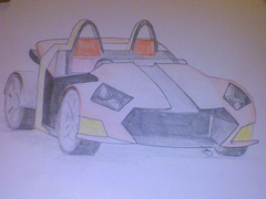
Unofficial Typhoon Valdris restyle
Hi all. I've exchanged a few emails with stuleah on the subject of a possible restyle of the Typhoon Valdris, and have sent him a few sketches.
I thought it would be interesting to see what you guys thought of this one - bearing in mind that it does not necessarily represent what stu is
planning, only what I would like to see! It will always be a marmite car because of its nature though...!
The pic is a bit fuzzy as I don't have access to m scanner at the moment - it was a sketchbook held up to laptop cam!!!
 
Valdris??
|
|
|
|
|
scudderfish
|
| posted on 18/2/11 at 10:06 AM |

|
|
I think it looks better than the original 
You should also show them to XBow so you only have to go through this rigmarole once.
Regards,
Dave
|
|
|
loggyboy
|
| posted on 18/2/11 at 10:10 AM |

|
|
Love the front end. The rear quarter panel looks too square IMO, may a repeat of the '<' shape similar to that of the front nose might
look a little more fluid.
|
|
|
designer
|
| posted on 18/2/11 at 11:02 AM |

|
|
I hate the front end.
Don't see the point of a smooth front on an 'edge' styled car.
|
|
|
Alex_The_Educated_Novice
|
| posted on 18/2/11 at 11:46 AM |

|
|
I like these threads, because my engineering novice-ness is quickly side-stepped.
I like this design, would agree that the front/rear dynamic needs resolving though. The overall aesthetic seems similar enough to what went before to
avoid alienating people who'd previously expressed an interest. Will headlamps, repeaters etc be scavenged or fabricated?
Also, you might need a little more clearance around those front wheels. 
We are all in the gutter, but some of us are looking at the stars.
|
|
|
Ninehigh
|
| posted on 18/2/11 at 07:01 PM |

|
|
The change to the cycle wings is exactly what I previously suggested 
Overall looks good

|
|
|
stuleah
|
| posted on 18/2/11 at 09:47 PM |

|
|
Keep the opinions coming everyone.
If anyone else fancies doing some doodles we are open to suggestions.
JC dont forget the rear has changed so it doesnt need to be as high. We like the front though.
Also we are building a completely new body which doesnt resemble the Valdris at present but are still trying to come up with something quick and easy
to do like this by JC.
|
|
|
JC
|
| posted on 18/2/11 at 10:07 PM |

|
|
Ok stu, I think that i have just the thing for the back end - i,ll email it to you hopefullymover the weekend.
Thanks for the comments, keep them coming.
|
|
|
loggyboy
|
| posted on 18/2/11 at 10:27 PM |

|
|
any pics of the bare chassis?
|
|
|
ettore bugatti
|
| posted on 20/2/11 at 01:21 AM |

|
|
Would to to give the design a try.
Some proper views would help. though
|
|
|
stuleah
|
| posted on 20/2/11 at 10:11 PM |

|
|
Just trying to upload some pics, in the mean time there are a lot of pics on the website.
www.typhoonsportscars.co.uk
|
|
|
stuleah
|
| posted on 20/2/11 at 10:18 PM |

|
|

|
|
|
stuleah
|
| posted on 20/2/11 at 10:27 PM |

|
|

Uploaded with ImageShack.us
|
|
|
stuleah
|
| posted on 20/2/11 at 10:29 PM |

|
|
Hope these all help!

Uploaded with ImageShack.us
|
|
|
AndyRead
|
| posted on 26/2/11 at 09:02 AM |

|
|
Hi Stu,
I like the overall design
As above I don't think the back does the front justice.
Not sure on the headlights?
But overall astheticly look good!
Look forward to the next step!
Andy
Andy 
|
|
|


