Alan B
|
| posted on 26/10/05 at 03:19 PM |

|
|
Proposed front mods...Comments?
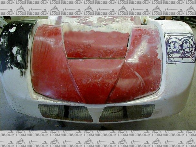
This is what I plan for the front.
2 little side grilles, and an air duct behind the radiator....I know it's a bit hard to visualise, but.........

|
|
|
|
|
donut
|
| posted on 26/10/05 at 03:22 PM |

|
|
Yup, that will look very nice in my opinion.
Go for it!
Andy
When I die, I want to go peacefully like my Grandfather did, in his sleep -- not screaming, like the passengers in his car.
http://www.flickr.com/photos/andywest1/
|
|
|
Avoneer
|
| posted on 26/10/05 at 03:40 PM |

|
|
I think one smooth flat one would look nice.
Pat...
No trees were killed in the sending of this message.
However a large number of electrons were terribly inconvenienced.
|
|
|
CommanderAce
|
| posted on 26/10/05 at 03:44 PM |

|
|
Flesh out the grill separators to look like snake fangs!
Roads? Where we're going we don't need roads!
|
|
|
David Jenkins
|
| posted on 26/10/05 at 03:50 PM |

|
|
Looks too sharp-edged at the moment - if the edges of the holes were curved back then they wouldn't look so 'cut out'.
Now, if there was one hole across, AND curved back, then that would look very tasty! 
David
|
|
|
Fozzie
|
| posted on 26/10/05 at 04:20 PM |

|
|
Nice to hear from you Alan!
Happy to see the car is safe from Hurricane Wilma..  
I hope all is well with you and yours.
ATB Fozzie
'Racing is Life!...anything before or after is just waiting'....Steve McQueen

|
|
|
Alan B
|
| posted on 26/10/05 at 07:15 PM |

|
|
Thanks everyone.
A few reponses...
"Looks too sharp-edged at the moment"
I see what you mean, but hopefully it's because of the 2 side grilles being fake right now. I'll try and put some depth if it's not
too much hassle.
"Flesh out the grill separators to look like snake fangs!"
Yep, I spotted that too..
"I think one smooth flat one would look nice.
Pat..."
Not sure what you mean Pat, can you elaborate?
"Yup, that will look very nice in my opinion"
Thanks
"Nice to hear from you Alan!
Happy to see the car is safe from Hurricane Wilma..
I hope all is well with you and yours.
ATB Fozzie"
And more thanks..  
|
|
|
Fozzie
|
| posted on 26/10/05 at 07:34 PM |

|
|
The consensus from us two, having seen the car 'in person' albeit 17 months ago....
Is, that what you are proposing, will really suit the car!!!!!!......dare I say, the grills look...ahem...very GT40-ish
Obviously you will be 'turning in' the edges in due course!
Excellent!
Fozzie
[Edited on 26/10/05 by Fozzie]
'Racing is Life!...anything before or after is just waiting'....Steve McQueen

|
|
|
tigris
|
| posted on 26/10/05 at 11:46 PM |

|
|
ducts
are the 2 side ducts brake intakes?
They might look a little better enlarged and pushed out porsche 911 style?
|
|
|
RazMan
|
| posted on 27/10/05 at 08:38 AM |

|
|
How about making the vertical sides of the centre cutout the same angle as the outer ones? At the moment it looks a little 'off'
When I am faced with a design dilemma, I normally scan the proposed components, print them out on paper and stick them to the body with photo mount
adhesive. Thay way you can move everything around until it look just right. I even used this method with my lights.
Cheers,
Raz
When thinking outside the box doesn't work any more, it's time to build a new box
|
|
|
derf
|
| posted on 28/10/05 at 04:31 PM |

|
|
I think that it looks good as is, just needs some depth. It needs to curv inside the body for a few inches, if you could fab up a lip to put on the
inide that would be great.
Just look at the mustang, how the front facia cutouts curve into the body.

|
|
|
cymtriks
|
| posted on 29/10/05 at 09:42 PM |

|
|
my suggestion:-
 
Rescued attachment meerkatf.JPG
|
|
|
Alan B
|
| posted on 31/10/05 at 01:23 PM |

|
|
quote:
Originally posted by cymtriks
my suggestion:-
Hmmmm....
There's no denying the logic in that suggestion. the lines do flow that way forr sure...
|
|
|
Mave
|
| posted on 31/10/05 at 05:19 PM |

|
|
Yep, Cymtriks suggestion with rolled-in edges would definately get my support.
And may I suggest the headlight arangement of the AS One (german car, can't seem to find a picture on the web anymore?!?!?!). It has a similar
shape at the headlights. I can mail you a picture if you want.
Marcel
|
|
|
Alan B
|
| posted on 31/10/05 at 06:59 PM |

|
|
Ironically....it did look that first around....

|
|
|
Mave
|
| posted on 31/10/05 at 08:14 PM |

|
|
Never doubt your first guess!
Well, the evolution of your bodywork is well worth it, so that line is not 100% correct.......
I'm still looking forward to the finished result Alan. Have been doing that for quite some years now! 
|
|
|
ned
|
| posted on 31/10/05 at 09:16 PM |

|
|
make sure it looks aggressive and not too smiley Alan 
think we need some more talented photoshoppers to show their wares 
beware, I've got yellow skin
|
|
|
Alan B
|
| posted on 1/11/05 at 12:32 PM |

|
|
quote:
Originally posted by ned
make sure it looks aggressive and not too smiley Alan 
think we need some more talented photoshoppers to show their wares 
Exactly Ned, that's why I like the snake/fang look at the top of the thread...
|
|
|
Alan B
|
| posted on 1/11/05 at 12:35 PM |

|
|
quote:
Originally posted by Mave
Never doubt your first guess!
Well, the evolution of your bodywork is well worth it, so that line is not 100% correct.......
I'm still looking forward to the finished result Alan. Have been doing that for quite some years now! 
Yeah, er..thanks...
It has been while hasn't it?
|
|
|
andygtt
|
| posted on 4/11/05 at 05:49 PM |

|
|
I like that first buck.
Andy
please redefine your limits.
|
|
|


