eddie99
|
| posted on 23/4/10 at 03:03 PM |

|
|
Dashboard Done
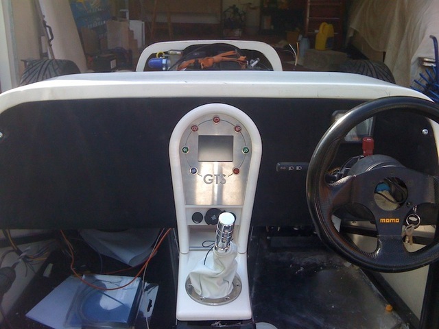
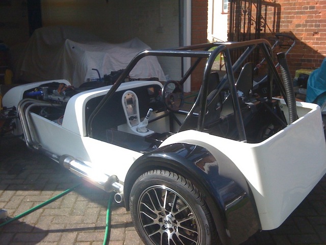
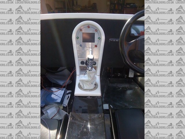
Finally got in done in the car:
 
Dash done!
 
dash done 2
 
dash done 3
What do you all think? All criticism welcome!
http://www.elitemotorsporteng.co.uk/
Twitter: @Elitemotoreng
Facebook: http://www.facebook.com/pages/Elite-Motorsport-Engineering/153409081394323
|
NOTE:This user is registered as a LocostBuilders trader and may offer commercial services to other users
|
|
|
clairetoo
|
| posted on 23/4/10 at 03:05 PM |

|
|
Only one fault - that is just far too cool 
Its cuz I is blond , innit
Claire xx
Will weld for food......
|
|
|
richardh
|
| posted on 23/4/10 at 03:05 PM |

|
|
looks fab
Time for a change!
|
|
|
omega0684
|
| posted on 23/4/10 at 03:08 PM |

|
|
looks bloody aweful!  (jealous much!) (jealous much!)
I love Pinto's, even if i did get mine from P&O!
|
|
|
big-vee-twin
|
| posted on 23/4/10 at 03:15 PM |

|
|
When you making mine, you know all the dims LOL!!
Duratec Engine is fitted, MS2 Extra V3 is assembled and tested, engine running, car now built. IVA passed 26/02/2016
http://www.triangleltd.com
|
|
|
tomprescott
|
| posted on 23/4/10 at 03:19 PM |

|
|
Looks awesome!
Only one thing - will all the shiney shiney reflect the sun back at you hiding the lcd screen?
A bird in the hand....
|
|
|
Yorkie
|
| posted on 23/4/10 at 03:20 PM |

|
|
Mate, thats 
Can I have one is green please? LOL
|
|
|
55ant
|
| posted on 23/4/10 at 03:22 PM |

|
|
cant say i like it to be honest, post it to me and ill dispose of it for you!
lol, that looks brilliant, really smart.
away from cars, now cycling and building TT bikes
|
|
|
mangogrooveworkshop
|
| posted on 23/4/10 at 03:27 PM |

|
|
That will give you something real solid to punch on the change up`s when the gear knob comes off........
You should have continued the theme for the rest of the dash and shape the bottom to get rid of the flat slab look that would make it look really
fab
[Edited on 23-4-10 by mangogrooveworkshop]
|
|
|
Vindi_andy
|
| posted on 23/4/10 at 03:29 PM |

|
|
That is far too good.
Im drooling 
|
|
|
TimC
|
| posted on 23/4/10 at 03:40 PM |

|
|
Fair play - that is nice! Your only problem? It makes the Sierra stalks look a bit sheeeet.
|
|
|
franky
|
| posted on 23/4/10 at 03:43 PM |

|
|
Looks awesome great looking car too. great looking car too.
IMO the acewell needs to go as its not built to the same level of 'finish' as the rest of the car..... Still looks good but I guess you
know what I mean!?
|
|
|
Dangle_kt
|
| posted on 23/4/10 at 03:44 PM |

|
|
love it!
|
|
|
speedyxjs
|
| posted on 23/4/10 at 04:02 PM |

|
|
That looks amazing! 
How long can i resist the temptation to drop a V8 in?
|
|
|
iscmatt
|
| posted on 23/4/10 at 04:04 PM |

|
|
I would swap the battery and hand brake lights over, symmetry with the hand brake on 
|
|
|
Humbug
|
| posted on 23/4/10 at 04:04 PM |

|
|
quote:
Originally posted by franky
Looks awesome great looking car too. great looking car too.
IMO the acewell needs to go as its not built to the same level of 'finish' as the rest of the car..... Still looks good but I guess you
know what I mean!?
Agree - personally I don't like those grey LCD screens much. a bit too "bike computer" for my liking.
But, the overall effect and simple yet striking design of the central section is brilliant!
|
|
|
zoom
|
| posted on 23/4/10 at 04:16 PM |

|
|
very nice 
mycar
mybuildsite
|
|
|
dlatch
|
| posted on 23/4/10 at 04:17 PM |

|
|
that looks superb

very jealous 
[Edited on 23/4/10 by dlatch]
|
|
|
RK
|
| posted on 23/4/10 at 04:25 PM |

|
|
Eddie, it's time to stop showing off, don't you think? That is the nicest dash I've seen on a 7alike. When are you going to market
it? I am sure many would be interested - you can offer with or without switches. And your - er - knob - looks good too. Where did that come from?
|
|
|
Miks15
|
| posted on 23/4/10 at 04:48 PM |

|
|
Looks really good ed! well done mate.
Just out of interest whats the middle screen for? Since i can see the acewell behind the wheel?
|
|
|
gottabedone
|
| posted on 23/4/10 at 04:51 PM |

|
|
oooh errrr missus
|
|
|
eddie99
|
| posted on 23/4/10 at 05:06 PM |

|
|
Thanks for all the fantastic comments. Im really chuffed!!
I've prob missed some but to answer some of the questions:
The gearknob is a fine coozer product! Highly recommend
The sierra stalk does look a bit crap if im honest. Not sure if there can be a direct replacement? Anyone know if you can just buy a flash stalk?
The screen in the centre is for a VI performance screen which does 0-60 times and g forces and basically a little gadget that i think is a bit of fun.
Am just looking into a satnav that is the same size to fit in that space though to change when needed. Although i haven't designed it for any
particular satnav and therefore i might not be able to charge it while in its position limiting battery life.
I will swap over the warning lights, think your way would definitely be better.
http://www.elitemotorsporteng.co.uk/
Twitter: @Elitemotoreng
Facebook: http://www.facebook.com/pages/Elite-Motorsport-Engineering/153409081394323
|
NOTE:This user is registered as a LocostBuilders trader and may offer commercial services to other users
|
Stuart_B
|
| posted on 23/4/10 at 05:26 PM |

|
|
nice one edd,
what size hole is that in the middle? i will have a look around for a satnav for you
stuart
black mk indy, 1.6pinto on cbr600 bike carb's.
|
|
|
stevebubs
|
| posted on 23/4/10 at 09:23 PM |

|
|
http://cgi.ebay.co.uk/Sierra-Polished-Alloy-Stalks-Set-Kit-C
ars-locost-/140397180387
|
|
|
omega0684
|
| posted on 23/4/10 at 09:27 PM |

|
|
i wonder how long it will all stay white? 
I love Pinto's, even if i did get mine from P&O!
|
|
|


