sgraber
|
 posted on 6/8/03 at 12:56 AM posted on 6/8/03 at 12:56 AM |

|
|
Opinions on my new Middy bodywork please
I have been busy building my mid-engine chassis and am pretty well along. You can look over in the mid-engine section or my website for details.... In
any case, this request for opinion is bodywork related.
I happen to think that the 'Brits (suppose that's most of members of this forum) have much better eye for automotive design than us
'Yanks... and so I offer up my design for your critique. It's strikingly similar to the new Gallardo. But I swear that my original design
was completed long before I saw that car! In any case, take a look if you wish and critique away. Remember that not all criticism needs to be
negative! It's strikingly similar to the new Gallardo. But I swear that my original design
was completed long before I saw that car! In any case, take a look if you wish and critique away. Remember that not all criticism needs to be
negative!
 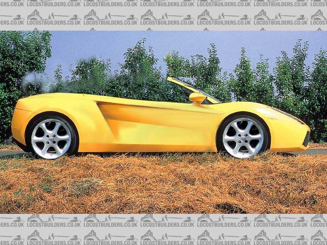
Rescued attachment Bala-from-Gallardo.jpg
Steve Graber
http://www.grabercars.com/
"Quickness through lightness"
|
|
|
|
|
sgraber
|
| posted on 6/8/03 at 12:57 AM |

|
|
Here is a side view of the original la Bala overlayed on the new design.
[Edited on 8/6/03 by sgraber]
 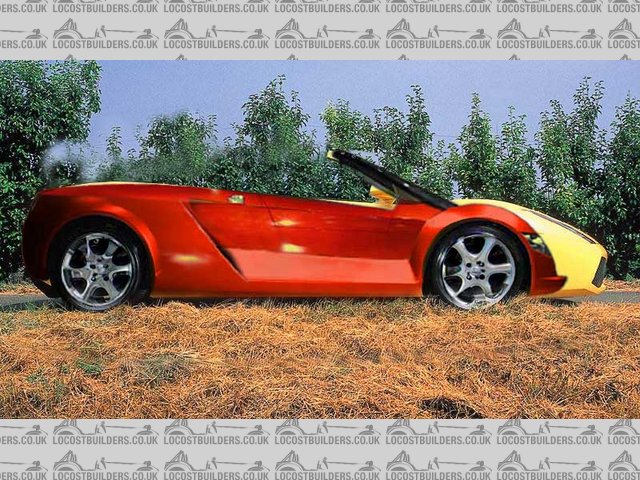
Rescued attachment Bala-over-Gallardo.jpg
Steve Graber
http://www.grabercars.com/
"Quickness through lightness"
|
|
|
Metal Hippy
|
| posted on 6/8/03 at 01:01 AM |

|
|
I have to admit, it's a nice looking machine from that view...
Nice sweeping lines...
I shall wander to your site and take a look what's there...
Good work.
Cock off or cock on. You choose.
|
|
|
blueshift
|
| posted on 6/8/03 at 02:40 AM |

|
|
That's very nice, in my apparently valid opinion as a Brit.
The main body top curve seems a little low around where it meets the windscreen.. it just looks a little sunken to me, the curve down from the front
wheel arch a little steep or long.
If it were mine I'd probably smooth that out / raise it up a bit.. but it could just be an angle thing, or just my brain.
very nice though. almost makes me want to go mid-engine 
|
|
|
pbura
|
| posted on 6/8/03 at 03:46 AM |

|
|
I really like your original design. It looks like a crazy little desert rat, but is also upscale at the same time.
How about splitting the difference and elongating the nose somewhat, but keeping the raised fenders? Sort of along the lines of a late 60s Can Am
Lola but contemporary?
My thinking is that it would make the car look a bit more menacing (if that's what you have in mind) but still unique.
New or old versions, your design work has been outstanding.
Pete
(a tasteless American) 
|
|
|
sgraber
|
| posted on 6/8/03 at 04:28 AM |

|
|
I reworked the design some more tonite and this is what I came up with. Shortened nose among other things. I apologize for the size of the images...
I will upload smaller ones next time...
 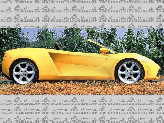
Rescued attachment Bala---Gallardo-1.jpg
Steve Graber
http://www.grabercars.com/
"Quickness through lightness"
|
|
|
Metal Hippy
|
| posted on 6/8/03 at 07:00 AM |

|
|
That's good, a nice compromise...
It matches the car better perhaps because of the short overhang at the back..
It was nice before, but this one's better.
Cock off or cock on. You choose.
|
|
|
theconrodkid
|
| posted on 6/8/03 at 07:31 AM |

|
|
i have to admit i agree with the hippy ,it do look good in version 3
who cares who wins
pass the pork pies
|
|
|
Jumpy Guy
|
| posted on 6/8/03 at 07:39 AM |

|
|
Just to differ...
I think that version 2 looks better, not that fond of the 'snub nose' look...
IMHO, version 3 looks a bit 'kit car' , which I know is a bit rich on this forum, version 2 seems better balanced..
but, either way, top result! 
|
|
|
Simon
|
| posted on 6/8/03 at 08:30 AM |

|
|
Well, of the two people in the office (me and colleague) who've seen it, so far approval is 100%.
Can't be bad.
ATB
Simon
|
|
|
ChrisW
|
| posted on 6/8/03 at 08:39 AM |

|
|
I like the top one best. Where can I get one? 
Chris
My gaff my rules
|
|
|
ned
|
| posted on 6/8/03 at 08:43 AM |

|
|
i like the top one, longer nose yellow version. something almost like the new lamborghini about it in a way (in my mind!) only thing i was unsure of
was how the wing mirrors mount, minor detail, great looking design...
Ned.
beware, I've got yellow skin
|
|
|
ceebmoj
|
| posted on 6/8/03 at 09:10 AM |

|
|
[Edited on 6/8/03 by ceebmoj]
|
|
|
Peteff
|
| posted on 6/8/03 at 09:17 AM |

|
|
The first one.
It looks better with the longer front. Some attention round the screen pillars would be beneficial in my opinion as it looks like an afterthought at
the moment and much too spindly to actually work.
yours, Pete.
yours, Pete
I went into the RSPCA office the other day. It was so small you could hardly swing a cat in there.
|
|
|
Spyderman
|
| posted on 6/8/03 at 09:43 AM |

|
|
I think they all look good and if you were to make any of them would have a car to die for!
My personal choice would be a cross between the red one and the last one.
I prefer the front of the last one and the rear wheel arches of the red one. The small flair for rear arch gives the eye something to focus on. Less
blunt front makes it look faster and less gokart-like.
Whichever way you go it will look cool!
There was that positive enough?
Terry
 
Spyderman
|
|
|
andyjack
|
| posted on 6/8/03 at 12:44 PM |

|
|
I prefer the second version. In my oppinion the 3rd version looks unbalanced almost like a cut and shut that has had the wrong front end fitted. I
think you need the long nose to balance out the sleek nature of the rear end.
|
|
|
blueshift
|
| posted on 6/8/03 at 01:03 PM |

|
|
long nose version is better in my opinion.
|
|
|
sgraber
|
| posted on 6/8/03 at 01:33 PM |

|
|
Thank You all very much! I probably should have made a poll out of this post, so I could tally the score! So much difference of opinion.  ay yay
yay.... ay yay
yay....
I discovered, after measuring the already built chassis, that the nose will have to be the longer one to fit the radiator and still keep the bonnet
profile I am envisioning.
The windshield surround will indeed be thicker since there is a 2"x.095 roll bar that serves as the frame.
The car does (now) borrow styling cues from the Lambo. The #2 nose profile is off the Gallardo.
Next time I post, I will include other views. In the meantime, I have to finish the chassis.
Thanks again! Your input is encouraging!
Graber
ps- you can follow the build progress at my website. I am updating regularly now in the diary section.
Steve Graber
http://www.grabercars.com/
"Quickness through lightness"
|
|
|
MustangSix
|
| posted on 6/8/03 at 05:04 PM |

|
|
It's a nice design, but I liked the long nose better and the little "gills" in the front seem a bit gratuitous, in my eye.
As far as Brit design sense, let us not forget a few shapes like the Daimler SP250......a car only a mother could love.
|
|
|
chrisg
|
| posted on 6/8/03 at 07:03 PM |

|
|
I like the long nose version too
And my opinion is better than every one else's
So there
Cheers
Chris 
Note to all: I really don't know when to leave well alone. I tried to get clever with the mods, then when they gave me a lifeline to see the
error of my ways, I tried to incite more trouble via u2u. So now I'm banned, never to return again. They should have done it years ago!
|
|
|
stephen_gusterson
|
| posted on 6/8/03 at 07:41 PM |

|
|
looks really good long, not so snub nosed.
atb
steve
|
|
|
Spyderman
|
| posted on 7/8/03 at 12:34 AM |

|
|
quote:
Originally posted by MustangSix
It's a nice design, but I liked the long nose better and the little "gills" in the front seem a bit gratuitous, in my eye.
As far as Brit design sense, let us not forget a few shapes like the Daimler SP250......a car only a mother could love.
But let's not forget the Daimler was built for the American market! 
Whenever a designer gets it wrong they just say it's for the American market.
Spyderman
|
|
|
Rorty
|
| posted on 7/8/03 at 02:24 AM |

|
|
Steve, definitely number 3, but minus the gills in front of the front wheel opening.
When will mine be ready for shipping? 
Cheers, Rorty.
"Faster than a speeding Pullet".
PLEASE DON'T U2U ME IF YOU WANT A QUICK RESPONSE. TRY EMAILING ME INSTEAD!
|
|
|
sgraber
|
| posted on 7/8/03 at 04:39 AM |

|
|
I re-measured the existing chassis and found some disturbing items. Mainly that my original illustrations won't exactly fit the chassis I have
already built because the windshield is in the wrong location. Also the scale of the wheels came out to be 19" rims... 
The following illustration is a more realistic representaion of the design as fitted onto the existing frame. Notice that the entire shape is slimmer
and the rear quarter-flank is longer.
Do you all think that this is a step backwards in the evolution of the design? Please let me know if the original is more desireable. If the
overriding consensus is to keep the taller design, then I will need to make some major changes to the chassis...  
Steve Graber
http://www.grabercars.com/
"Quickness through lightness"
|
|
|
sgraber
|
| posted on 7/8/03 at 04:44 AM |

|
|
oops - must post image ....
 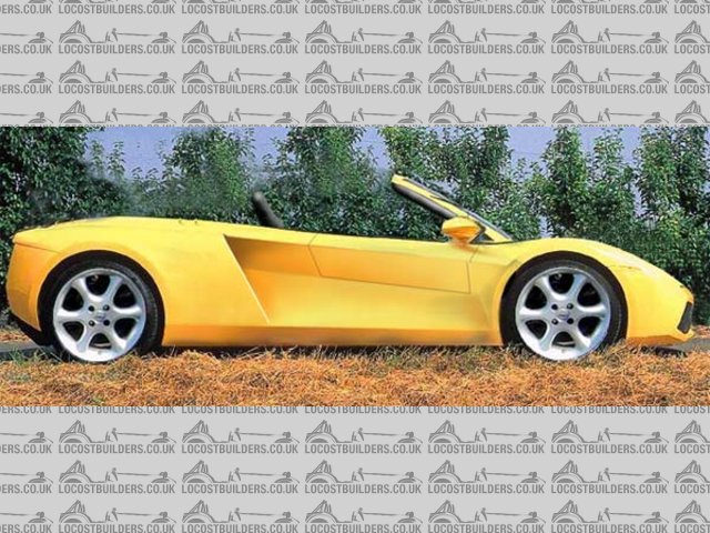
Rescued attachment Bala-Gallardo-2-lowered.jpg
Steve Graber
http://www.grabercars.com/
"Quickness through lightness"
|
|
|


