GaryM
|
| posted on 24/3/05 at 02:44 PM |

|
|
New Dash Design
Guys
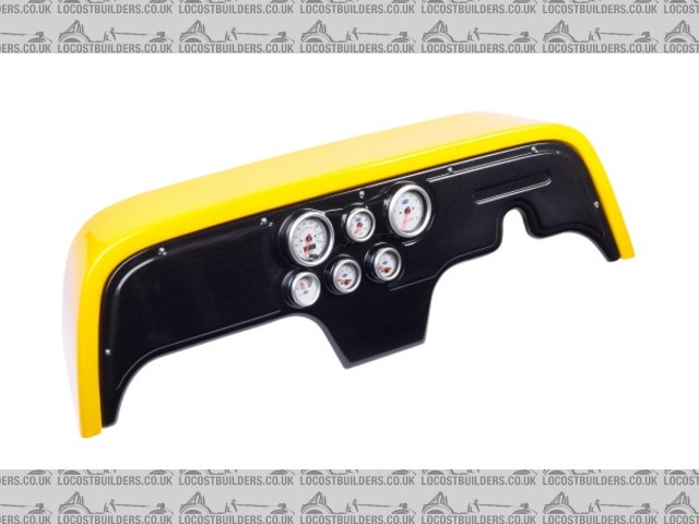
We are looking for some feedback regarding a new carbon look dashboard we are developing.
 
Carbon Look Dash
 
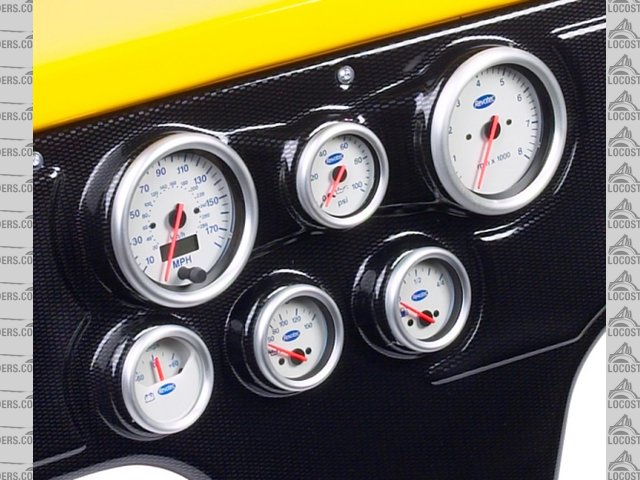
Carbon Look Dash - Gauge Pods
The dash has been moulded in thick carbon look ABS and is totally SVA compliant. It features angled gauge pods (for excellent driver visibility) and a
moulding for a "BRIGHT 6" LED illuminated warning light module or more conventional warning lamps.
We will also be supplying colour co-ordinated gauge sets and a matching steering column cowl.
The dash pictured is a bespoke version developed for GTS Tuning although we are also producing a universal version that is supplied with an untrimmed
flange, so should fit most scuttles.
We would welcome any feedback on the layout/design but also appreciate information relating to the shape and size of the scuttles builders have
used.
If anyone can supply detailed dimensions (or better still) a paper template indicating the available dash area for your scuttle/transmission
tunnel/gear-stick combination we would show our appreciation with a discount on the finished product.
For futher details please contact gary.meades@kartsmart.co.uk
Many thanks
Gary
[Edited on 24/3/05 by GaryM]
[Edited on 24/3/05 by GaryM]
[Edited on 24/3/05 by GaryM]
|
|
|
|
|
zetec
|
| posted on 24/3/05 at 02:49 PM |

|
|
Would look a lot better with invisible fixings.
|
|
|
phelpsa
|
| posted on 24/3/05 at 03:00 PM |

|
|
Where about in berkshire are you based??
|
|
|
flak monkey
|
| posted on 24/3/05 at 03:06 PM |

|
|
It looks great IMO.  I think black headed fixings would finish it off. I also think the gauges look good with silver bezels. If they were CF
look-a-like too, it may be a bit much. I think black headed fixings would finish it off. I also think the gauges look good with silver bezels. If they were CF
look-a-like too, it may be a bit much.
Steering column cowels sounds like a good idea. Would finish the whole interior off nicely.
David 
Sera
http://www.motosera.com
|
|
|
DaveFJ
|
| posted on 24/3/05 at 04:17 PM |

|
|
I like the moulding and the layout, not so sure about the CF look - it seems everyone wants to have a CF effect dash these days - it's all a
little too common for me!
I suppose it could be painted easy enough.
there are a couple of minor things that I am thinking of when I finally get to the dash stage which would be hard to add without making the dash look
crap, namely a matching clock (as in time) and a small glove box. also possibly a start button, cigarette lighter (for powering things like a snooper
otr mobile phone) and maybe even a stereo?
maybe it would be possible to make it modular with the centre section (where the dials are) being a seperate moulding which could be swapped for
different layouts/requirements?
General comment though - Great! looks really nice
Dave
"In Support of Help the Heroes" - Always
|
|
|
britishtrident
|
| posted on 24/3/05 at 05:38 PM |

|
|
Don't like the fake CF effect, also looks too fussy would look better as a plain flat dash with recess for standard clocks.
[Edited on 24/3/05 by britishtrident]
|
|
|
tks
|
| posted on 24/3/05 at 07:00 PM |

|
|
nahh
if you zoom in looks like something but the first impression is a plastic look..
and plastic is cheap...
i don't like it..
would like it if there where more fixings..(black ones)
and if it was plain...exept the final edge where your legs are..(rounded, SVA no rubber needed..)
clocks idea is good but do it with more angle or let it be plain..
just my opinion..
TKS
The above comments are always meant to be from the above persons perspective.
|
|
|
Triton
|
| posted on 24/3/05 at 08:14 PM |

|
|
Argh that's where the yellow scuttle went then
|
|
|
jazzymonkey
|
| posted on 10/8/05 at 01:41 PM |

|
|
I think it looks well cool! Any plans for a velocity one?
|
|
|
jon_boy
|
| posted on 10/8/05 at 04:33 PM |

|
|
I think it looks nice. And like someone siad earlier a removable panel for options such as stereo etc. Is it meant to look like CF? I think its nice
just black anyway, which is all i can really see with my poop computer......
|
|
|
Triton
|
| posted on 12/9/05 at 06:49 AM |

|
|
Dash board blokes,
how did the 2nd race go Sunday...?
Cheers
Mark
|
|
|


