nick205
|
| posted on 15/9/05 at 07:44 PM |

|
|
dash layout - opinions please...
Just planning the layout of my dash before I start cutting holes.
Instruments are ETB (thanks Vince for the Tacho!). Warning lamps will be from SVC although I may use a Bright 6 module.
Which layout looks best (I'm leaning towards the first one)?
[Edited on 15/9/05 by nick205]
|
|
|
|
|
nick205
|
| posted on 15/9/05 at 07:50 PM |

|
|
design 1
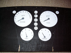 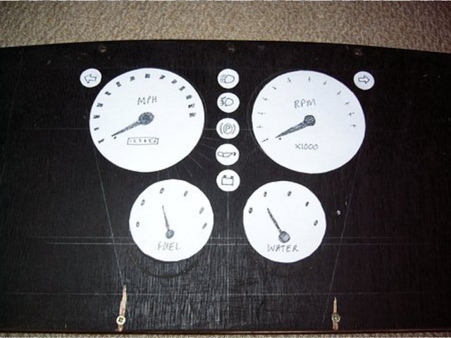
Rescued attachment P1030077.JPG
|
|
|
nick205
|
| posted on 15/9/05 at 07:50 PM |

|
|
design 2
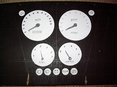 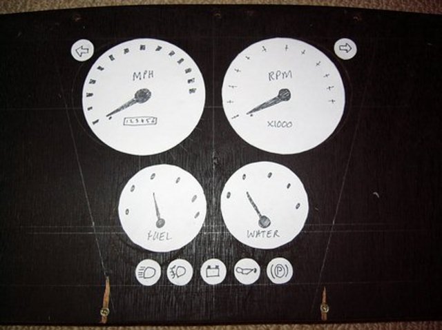
Rescued attachment P1030083.JPG
|
|
|
nick205
|
| posted on 15/9/05 at 07:50 PM |

|
|
design 3
 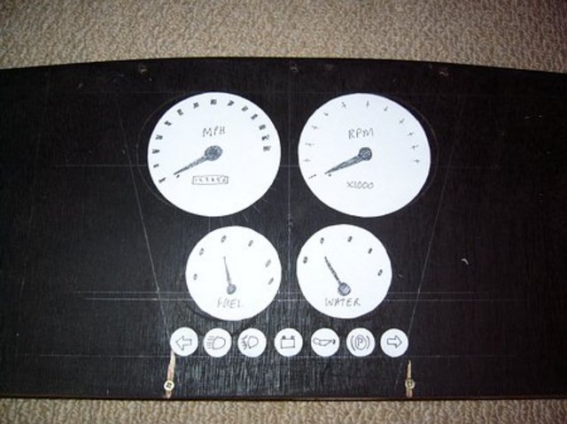
Rescued attachment P1030084.JPG
|
|
|
nick205
|
| posted on 15/9/05 at 07:51 PM |

|
|
design 4
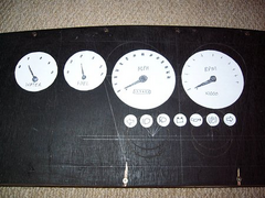 
Rescued attachment P1030087.JPG
|
|
|
nick205
|
| posted on 15/9/05 at 07:51 PM |

|
|
design 5
|
|
|
nick205
|
| posted on 15/9/05 at 07:52 PM |

|
|
(bugger) design 5
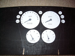 
Rescued attachment P1030088.JPG
|
|
|
nick205
|
| posted on 15/9/05 at 07:53 PM |

|
|
design 6
 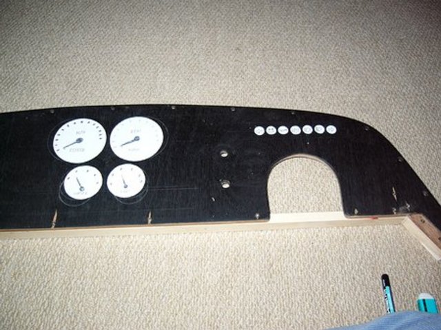
Rescued attachment P1030091.JPG
|
|
|
shortie
|
| posted on 15/9/05 at 07:55 PM |

|
|
love the first one
|
|
|
slim Jim
|
| posted on 15/9/05 at 08:09 PM |

|
|
Number one's getting top marks 
(Followed by number 2 as a close second!)
|
|
|
Avoneer
|
| posted on 15/9/05 at 08:21 PM |

|
|
How about as design 3, but the tell tales in a pyramid under the three dials - 4 across and 3 across underneath.
Just like mine was.
Pat...
No trees were killed in the sending of this message.
However a large number of electrons were terribly inconvenienced.
|
|
|
ceebmoj
|
| posted on 15/9/05 at 08:33 PM |

|
|
number 1
looks great IMHO
|
|
|
nick205
|
| posted on 15/9/05 at 08:38 PM |

|
|
did think about that Pat, but I have a batten glued along the bottom edge on the inside (for adding the radius) so I can't go any lower.
Have you got any pics of your dash Pat?
[Edited on 15/9/05 by nick205]
|
|
|
907
|
| posted on 15/9/05 at 08:54 PM |

|
|
Hi,
I like "bugger" (5)
IMHO warning lights need to be high up, where they will catch your eye.
Swap the oil light over to the right, it needs to be very visable.
If your going to pad out & vinyl cover, don't have the gauges too close.
It's easier to cover a wider gap.
Looking good.
Paul G
|
|
|
bob
|
| posted on 15/9/05 at 08:57 PM |

|
|
I like number 1 a lot but i'd put the indicator lights in the middle either side of oil/ignition lights.
|
|
|
nick205
|
| posted on 15/9/05 at 09:03 PM |

|
|
Like this?
I quite like it 
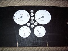 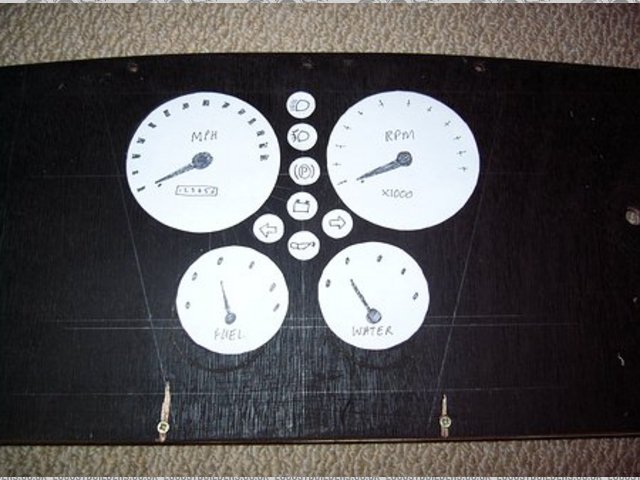
Rescued attachment P1030092.JPG
|
|
|
Chris_R
|
| posted on 15/9/05 at 09:10 PM |

|
|
Design 1. Simple and symmetrical.
A bit of slapstick never hurt anyone.
http://www.chris.renney.dsl.pipex.com/

|
|
|
omega 24 v6
|
| posted on 15/9/05 at 09:21 PM |

|
|
I like 2 mate indicators at top and each side just like my omega
|
|
|
Jon Ison
|
| posted on 15/9/05 at 09:22 PM |

|
|
5
|
|
|
sonic
|
| posted on 15/9/05 at 09:30 PM |

|
|
Hi There
What about like this
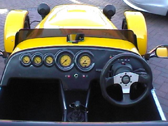 
Rescued attachment jvn154.jpg
|
|
|
sonic
|
| posted on 15/9/05 at 09:32 PM |

|
|
another
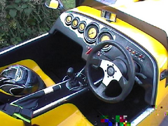 
Rescued attachment jvn182.jpg
|
|
|
RazMan
|
| posted on 15/9/05 at 09:35 PM |

|
|
Number 2 floats my boat 
Cheers,
Raz
When thinking outside the box doesn't work any more, it's time to build a new box
|
|
|
Avoneer
|
| posted on 15/9/05 at 09:47 PM |

|
|
Like this:
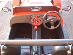 
Rescued attachment 1.jpg
No trees were killed in the sending of this message.
However a large number of electrons were terribly inconvenienced.
|
|
|
cryoman1965
|
| posted on 15/9/05 at 09:52 PM |

|
|
Hi nick, nice to see the Gauges made it into the budget, 1 looks good to me Cheers Nige  
|
|
|
mookaloid
|
| posted on 15/9/05 at 10:04 PM |

|
|
6 
|
|
|


