sgraber
|
| posted on 14/9/07 at 05:50 AM |

|
|
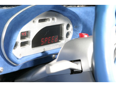
My new digidash installed
For inspiration/information purposes...
I present the Grabercars La Bala Dash.

The dashboard is a piece of urethane foam 25mm covered in 1 layer of fiberglass, then a 5mm layer of medium density foam glued down and a weave
textured outdoor grade vinyl stretched over, glued and stapled underneath. It's very light. My daughter says if I ever get to a beach in the car
I can remove the dash and ride waves with it like a boogie board!
The center console is more of the fiberglass covered urethane foam board, the 5mm foam and covered in a black marine grade tonneau canvas.
The gauge is a Mychron3 Plus and the switch gear is attached to an aluminium bar that I annealed to bend, then wrapped behind the gauge and out each
side. Simply headlamp hi-lo switch and turn signal switch. That's it. Room for one more switch on the right side next to the turn signal switch.
I'm still fettling with the eyebrow/cover as you can see it's not quite attached yet, but otherwise the dash is installed and functional.


I think I will still create some abs plastic interior panels to cover the door sides and below the dash.
Thoughts?
Steve Graber
http://www.grabercars.com/
"Quickness through lightness"
|
|
|
|
|
donut
|
| posted on 14/9/07 at 06:21 AM |

|
|
Cool, let us know how you get on calibrating the speedo, i'm interested to know.
Andy
When I die, I want to go peacefully like my Grandfather did, in his sleep -- not screaming, like the passengers in his car.
http://www.flickr.com/photos/andywest1/
|
|
|
Avoneer
|
| posted on 14/9/07 at 06:50 AM |

|
|
I'd be more inclined to put the turn switch on the left with the other switches away from the wheel.
Wouldn't want to be fumbling around behind the wheel when trying to switch it off.
Apart from that, looks good.
Pat...
No trees were killed in the sending of this message.
However a large number of electrons were terribly inconvenienced.
|
|
|
RazMan
|
| posted on 14/9/07 at 07:29 AM |

|
|
Steve, I know I can offer you honest criticism without risking offending you  IMO the dash looks rather 'industrial' and would look much
better recessed into a binnacle with switches either side. This would give it more unity with the interior and blend in better - the switches would
also be tucked out of harms way. IMO the dash looks rather 'industrial' and would look much
better recessed into a binnacle with switches either side. This would give it more unity with the interior and blend in better - the switches would
also be tucked out of harms way.
You might also want to consider putting a vertical return to the whole dash area decending to meet the central tunnel, making it a 90 degree assembly
which would be more rigid and less of a knife edge for safety reasons (and less like a boogie board  ) )
Something like my dash but with more 'panel' either side?
[Edited on 14-9-07 by RazMan]
 
Rescued attachment Aeon Dash 2.jpg
Cheers,
Raz
When thinking outside the box doesn't work any more, it's time to build a new box
|
|
|
RazMan
|
| posted on 14/9/07 at 07:46 AM |

|
|
Here's another pic with the dash out of the car.
 
Rescued attachment Aeon Dash.jpg
Cheers,
Raz
When thinking outside the box doesn't work any more, it's time to build a new box
|
|
|
sgraber
|
| posted on 14/9/07 at 01:40 PM |

|
|
Yes, I do actually accept criticism without offense! And in this instance you are really on the money.
The more I think about it, the more I think the dash doesn't go with the rest of the car. It may be time for a complete redesign of the
interior, including the center console and the side panels....
I think I will concentrate on that entire changeover once I have finalized my new chassis plans. Which I have now made available for
'pre-sale' btw. Some suspesnion drawings still not completely done, but close enough that I am selling the plans without them at a deep
discount with my promise to ship the remainder of the drawings free when completed.
Steve Graber
http://www.grabercars.com/
"Quickness through lightness"
|
|
|
Fred W B
|
| posted on 14/9/07 at 02:31 PM |

|
|
Hi Steve
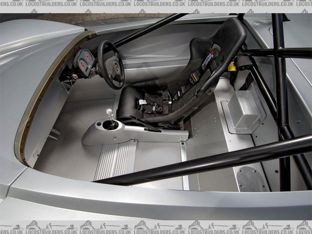
If you are going to rethink the interior, have a look at this pic of, I think, a stripped out elise or 340R?. I just love this interior, except for
the unfinished instrument binnacle and that raw GRP box at the bottom rear centre.
Cheers
Fred W B
 
cocpit
You can do it quickly. You can do it cheap. You can do it right. Pick any two.
|
|
|
sgraber
|
| posted on 14/9/07 at 04:21 PM |

|
|
Fred, that gives me a great idea. Thank you.
Steve Graber
http://www.grabercars.com/
"Quickness through lightness"
|
|
|
sgraber
|
| posted on 14/9/07 at 06:23 PM |

|
|
quote:
Originally posted by donut
Cool, let us know how you get on calibrating the speedo, i'm interested to know.
The dash attaches to the laptop via usb, where all of the parameters can be viewed and modified. For wheel speed I simply enter the circumference in
mm. Should be quite accurate.
Steve Graber
http://www.grabercars.com/
"Quickness through lightness"
|
|
|
gottabedone
|
| posted on 15/9/07 at 10:29 AM |

|
|
Hi Steve,
I agree with what Raz is saying - the stripped out look is good but you are looking for the stripped out look with class!!
Maybe fill in some of the gaps around the pod and play with some more ali?
I like the two textures that you are using - the fabric on the dash and the wrinkle like finish on the pod. Both I presume are form and function in
the respect of looking good and being anti-glare.
.......I also like the transition from dash to centre console.
keep up the (very)good work
regards
Steve
|
|
|


