PeterV
|
| posted on 19/2/11 at 08:23 PM |

|
|
WLR Decal Argument
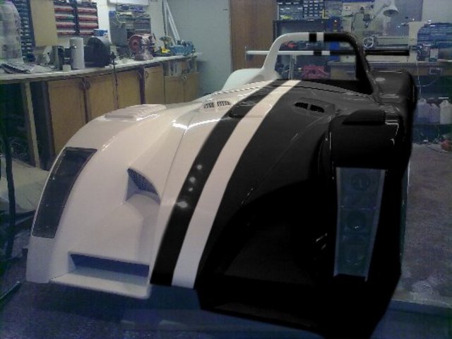
Woe is me. Being beaten up by wife, son, friends & helpers! No one can agree on the decals for this car.
We have in the White corner "Leave it white"
In the Black corner "White is boring so loads of stuff like a real race car"
In the Blue corner "Just logos of those who have helped"
In the Compromise corner (that'll be me then) this

And let's not even get started on the bonnet decals 
Comments please, he said hoping for some sort of unanimity but kind of expecting more woes from those around this project 
I don't know, all this work and what are the squabbles are about? Colour! I thought colour was only a girly issue 
|
|
|
|
|
PSpirine
|
| posted on 19/2/11 at 08:28 PM |

|
|
Black corner or white corner - all or nothing.
|
|
|
RichieW
|
| posted on 19/2/11 at 08:33 PM |

|
|
It's hardly a boring shape as it is. Doesn't need tarting up to create interest.
|
|
|
tomgregory2000
|
| posted on 19/2/11 at 08:33 PM |

|
|
Pink wheels 
|
|
|
PeterV
|
| posted on 19/2/11 at 08:39 PM |

|
|
quote:
Originally posted by tomgregory2000
Pink wheels 
Oh C*/\p that's torn it..... tiz going the girly route 
|
|
|
PAUL FISHER
|
| posted on 19/2/11 at 09:20 PM |

|
|
Got to be the black corner for me
|
|
|
Steve Hignett
|
| posted on 19/2/11 at 09:29 PM |

|
|
Really sorry, but your (OP) choice is the worst one!
And if it were mine, it would be proper stickered up!
|
|
|
skydivepaul
|
| posted on 19/2/11 at 09:31 PM |

|
|
make it look like a race car
race numbers on side and bonnet (remember to put a line through them for road use)
http://www.smartideasuk.com
http://www.smartmapping.co.uk
HD CCTV
3D design solutions and integration
IP security systems
access control systems
|
|
|
austin man
|
| posted on 19/2/11 at 09:39 PM |

|
|
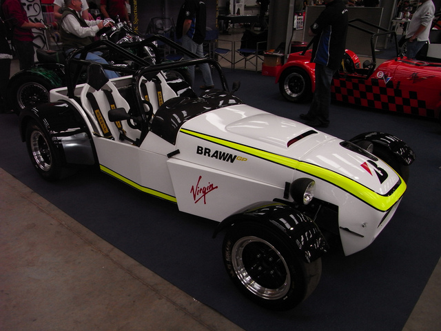
use the Brawn colours looks excellent on white. There was an Mk with the colur scheme really effective
Life is like a bowl of fruit, funny how all the weird looking ones are left alone
|
|
|
Daddylonglegs
|
| posted on 19/2/11 at 09:53 PM |

|
|
Paint the car black, and use gold decals   Sorry, had to be different I'm afraid Sorry, had to be different I'm afraid 
It looks like the Midget is winning at the moment......
|
|
|
austin man
|
| posted on 19/2/11 at 09:55 PM |

|
|
JPS colour scheme good choice me thinks
Life is like a bowl of fruit, funny how all the weird looking ones are left alone
|
|
|
Daddylonglegs
|
| posted on 19/2/11 at 10:00 PM |

|
|
Yup, got it in one  
It looks like the Midget is winning at the moment......
|
|
|
gottabedone
|
| posted on 19/2/11 at 10:03 PM |

|
|
Definitely needs colour - look at the Radical in red and yellow
................what about vinyl?
Steve
|
|
|
StevieB
|
| posted on 20/2/11 at 12:12 AM |

|
|
Stick some black bordered number panels on the sides and bonnet, and maybe a couple of racing stripes for a bit of interest.
If you must make it a replica of a race car, then I say go down the martini route.
|
|
|
indykid
|
| posted on 20/2/11 at 12:32 AM |

|
|
take inspiration from a racing colour scheme, but not one of the iconic schemes that everyone knows. gulf, martini, JPS, rothmans etc. nothing looks
more tragic to my eye.
being brutally honest, i think the dragon graphic that's on it now would be the quickest way to spoil a really nice car
|
|
|
norfolkluego
|
| posted on 20/2/11 at 01:15 AM |

|
|
quote:
Originally posted by tomgregory2000
Pink wheels 
Good shout - tasteful 
|
|
|
norfolkluego
|
| posted on 20/2/11 at 01:28 AM |

|
|
Remember the Wheeler Dealers Fiat 500 with the stripes, that would look good. Gorgeous car anyway it would look good whatever.
|
|
|
Macbeast
|
| posted on 20/2/11 at 06:01 AM |

|
|
It's beautiful as it is. Less is more. Stickers, etc are just meaningless trashy bling.
Oh you're from Essex? Go ahead then: it's obligatory 
I'm addicted to brake fluid, but I can stop anytime.
|
|
|
Ivan
|
| posted on 20/2/11 at 08:10 AM |

|
|
I'm in the black corner - but agree - don't copy iconic team colours - be inventive.
Also - racing numbers on a road car is just wrong.
If you keep it white I think Kawasaki green wheels would lift it.
|
|
|
marcjagman
|
| posted on 20/2/11 at 09:00 AM |

|
|
How about quecks on opposite corners? You know, the ones that look like a flag.
|
|
|
scootz
|
| posted on 20/2/11 at 09:31 AM |

|
|
quote:
Originally posted by indykid
being brutally honest, i think the dragon graphic that's on it now would be the quickest way to spoil a really nice car
Have to agree... that looks tacky as hell. Maybe even tackier! 
It's Evolution Baby!
|
|
|
loggyboy
|
| posted on 20/2/11 at 09:44 AM |

|
|
Why not paint one half black, leave the other white. Do a double stripe down the middle so that it doesnt just look like you painted half and ran our
of money!
|
|
|
loggyboy
|
| posted on 20/2/11 at 09:58 AM |

|
|
Like this?
 
WLR-Black&White
[Edited on 20/2/11 by loggyboy]
|
|
|
DRC INDY 7
|
| posted on 20/2/11 at 10:13 AM |

|
|
quote:
Originally posted by austin man
use the Brawn colours looks excellent on white. There was an Mk with the colur scheme really effective
Yea i second the brawn gp colours thats what i would have if my car was white it stands out and is clean and simple design

[Edited on 2/20/2011 by DRC INDY 7]
https://www.facebook.com/groups/462610273778799/
Puddle Dodgers Club
|
|
|
PeterV
|
| posted on 20/2/11 at 10:15 AM |

|
|
mmmm as suspected no sway one way or the other then.
Glad I did a Paintshop impression of it coz it has helped shift opinion in the workshop. Seems like the quickest way to see what will be. Even if just
makes it safe to drive one way though Harare, just don't turn around and come back the other (loggyboy), although I love the comprise factor

Shall continue to ponder for a few weeks yet coz there is no rush. The white paintwork is now super glossy so things can remain like that for as long
as it takes. Paintwork and decals are an expensive and major bit of work, especially on a WLR with so much bodywork, so want to get it right.
I guess the Beasts little helpers will want thier Griffin some place but thats easy, but apart from that who knows?
Cheers guys keep the comments comming 
PS @ £700 a set the wheels are stay'in black 
|
|
|


