ZEN
|
| posted on 25/8/04 at 08:41 PM |

|
|
Toniq-R
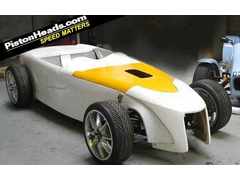
This noscone would look realy good on a locost and the lines seam not to be complicated to make a mold.
[Edited on 25/8/04 by ZEN]
 
Rescued attachment toniq-r.JPG
My YouTube channel Cars, bikes - track days, motorsport, sim racing and more.
|
|
|
|
|
David Jenkins
|
| posted on 25/8/04 at 09:08 PM |

|
|
It looks better when it's complete - I still didn't really like the thing, though. Just not to my taste, but plenty of people liked
it.
David
|
|
|
Guinness
|
| posted on 25/8/04 at 09:19 PM |

|
|
I really liked the Toniq when i saw it at Donnington last year. But as far as i know, almost a year later, they are still not actually taking orders?
|
|
|
andyps
|
| posted on 25/8/04 at 09:27 PM |

|
|
Supposed to be launched at Donnington this year. I like it - may have to ditch the seven nosecone I have bought already!!
Andy
An expert is someone who knows more and more about less and less
|
|
|
locost_bryan
|
| posted on 26/8/04 at 12:30 AM |

|
|
doesn't it breach Chrysler's copyright on the Plymouth Prowler? 
very hot-roddy 
Bryan Miller
Auckland NZ
Bruce McLaren - "Where's my F1 car?"
John Cooper - "In that rack of tubes, son"
|
|
|
andyps
|
| posted on 26/8/04 at 09:42 AM |

|
|
quote:
Originally posted by locost_bryan
doesn't it breach Chrysler's copyright on the Plymouth Prowler? 
very hot-roddy 
As you can buy a kit which uses some genuine Prowler parts and looks just like a Prowler I don't think Plymouth/Chrysler will complain about the
Toniq-R. I agree, very hot-roddy, and I love the Prowler too.
Andy
An expert is someone who knows more and more about less and less
|
|
|
ZEN
|
| posted on 26/8/04 at 10:32 AM |

|
|
The Toniq-R is a project of Universiti of Huddersfield URL
The first production modoles should see the ligt in september.
I realy like the futuristic look. Seen pics of some finished prototypes and is completly diferent from the Prowler.
My YouTube channel Cars, bikes - track days, motorsport, sim racing and more.
|
|
|
drmike54
|
| posted on 26/8/04 at 06:47 PM |

|
|
Are you allowed to drive a car with no fenders on the road?
|
|
|
andyps
|
| posted on 26/8/04 at 07:35 PM |

|
|
I don't think so - the finished car will have cycle wings on all four wheels.
Andy
An expert is someone who knows more and more about less and less
|
|
|
Cita
|
| posted on 27/8/04 at 07:51 AM |

|
|
It's probably me but what's so nice about this car?
It's a square box with an ugly nosecone and once those cycle wings are mounted the looks will certainly not improve.
Hell i even liked the car with that toyota engine in the back more than this one!
All IMHO of course
|
|
|
ZEN
|
| posted on 27/8/04 at 10:07 AM |

|
|
@Cita
beauty is in the eye of the beholder 
My YouTube channel Cars, bikes - track days, motorsport, sim racing and more.
|
|
|
Alan B
|
| posted on 27/8/04 at 02:59 PM |

|
|
quote:
Originally posted by Cita
It's probably me but what's so nice about this car?
It's a square box with an ugly nosecone and once those cycle wings are mounted the looks will certainly not improve.
Hell i even liked the car with that toyota engine in the back more than this one!
All IMHO of course
Yep, agreed.......different from the usual "seven" style, but that's about all.....IMO
|
|
|
Ian Pearson
|
| posted on 27/8/04 at 07:15 PM |

|
|
The Toniq-R reminds me of the saying," How can you be so ugly with only one face?"  
|
|
|
phelpsa
|
| posted on 27/8/04 at 07:24 PM |

|
|
I saw one of those in the Stuart Taylor workshops.
Adam
|
|
|
Cita
|
| posted on 28/8/04 at 06:49 AM |

|
|
Beauty is an act of comparison IMHO.Toniq R is perhaps a nice looking US roadster but an ugly Lotus Seven dereviate.
|
|
|
phelpsa
|
| posted on 28/8/04 at 08:09 AM |

|
|
Just read about it in the Kit Car mag, I saw it in the ST workshops because it has all ST parts except for the bodywork.
Adam
|
|
|
undecided
|
| posted on 28/8/04 at 08:22 AM |

|
|
Hurray at last someone with the sense not to copy, shame the lads from Huddersfield couldn't have carried on and made it rather than let someone
else take the credit for it.
I wonder how many Toniq R clones will appear now!!!!!!
|
|
|
Cita
|
| posted on 28/8/04 at 04:28 PM |

|
|
I hope not too many 
|
|
|
Dale
|
| posted on 28/8/04 at 05:23 PM |

|
|
Maybe its just me but the only thing that I dont really like is that there is no drop at the passengers compartment. How can you have an open
roadster that you only see out of from the upper shoulder level. I am throwing alot of North American hot rod into my build (basically a different
nose-similar to the Marlin sportster and curved ass end) But it would be ungly in my mind if I did not keep the origanl sloped back armrest sides so
to speak. Look at a 7 or a Tr3 and to me its the very first thing that you notice even befoe the open wheels on the 7 or anything else. To me it
defines the car.
just my opinion
Dale
|
|
|
ZEN
|
| posted on 29/8/04 at 05:50 PM |

|
|
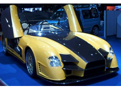
Here is another interesting desing. I think it is a Sbarro prototype and it seams based on a sevenesque chassi.
 
Rescued attachment sbarro_sportscar3.JPG
My YouTube channel Cars, bikes - track days, motorsport, sim racing and more.
|
|
|
derf
|
| posted on 30/8/04 at 04:54 PM |

|
|
I dunno, I like it, I think it looks good in a futuristic way. Although I agree that more elbow room would definatly look good, the nose I think is a
great interpretation of the future of locost bodywork.
|
|
|
mackie
|
| posted on 2/9/04 at 09:03 AM |

|
|
I like it, a nice clean interpretation. It's a hell of a lot better looking than most "original" kit designs IMO. I do agree though
that it looks pretty featureless from the side and could do with a sloped dip around the passenger compartment in much the shape of the perforated ali
stuff in this pic:

(I think it looks a little overstyled with all those grills too, I'd keep it plain diamond mesh for the grill I think).
|
|
|
Mave
|
| posted on 2/9/04 at 03:17 PM |

|
|
I definately like it. Maybe it's not perfect (side view) but that are a lot of nice touches, and I appreciate the effort to try and bring the
Lotus Seven design to a new era.
Aren't there enough Sevens which look so much alike already?!?!?
(ehh, don't get me wrong, I also like to classic shape; but everybody uses just a tiny variation on that shape! It's just boring!)
So for me; two thumbs up (one for the design, and one for the effort)
|
|
|
Hellfire
|
| posted on 2/9/04 at 09:39 PM |

|
|
IMHO - it has a strange kind of appeal... 
The grille does it no favours though...

|
|
|


