derf
|
| posted on 25/10/05 at 04:33 AM |

|
|
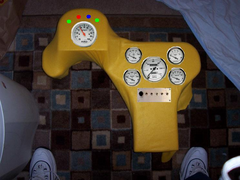
dash layout, opinions wanted
not to scale
looking for input...
and dont tell me that the steering wheel is on the wrong side, yours is wrong 
 
dash layout
[Edited on 25/10/05 by derf]
|
|
|
|
|
donut
|
| posted on 25/10/05 at 06:54 AM |

|
|
Good greif!
Would look better when it's an actual dash as that pic looks very deep. Actually i think it would look great when it's on.
By the way us brits founded the good ol U S of A so it's you who drive on the wrong side!!!    
Andy
When I die, I want to go peacefully like my Grandfather did, in his sleep -- not screaming, like the passengers in his car.
http://www.flickr.com/photos/andywest1/
|
|
|
Hellfire
|
| posted on 25/10/05 at 07:41 AM |

|
|
Looks good... it'll be interesting to see it when it's complete. 

|
|
|
Jonte
|
| posted on 25/10/05 at 07:54 AM |

|
|
Looks good though it´s hard to judge when it´s not inplace.
Just a few thoughts about it.
I can see that yellow dash suits the colour of the rest the car. But it will get dirty quickly.
You have a perfect mould to make an carbonfibre dash 
The small plate with the switches could be brushed aluminum.
Smaller warninglights with a small chrome ring around them.
just my thoughts... 
Click it

|
|
|
Tigger
|
| posted on 25/10/05 at 09:02 AM |

|
|
Blimey,
that certainly looks different and afterall, different is good.
Maybe I should update my DASH DESIGNER to include such unique designs too
Tigger

|
|
|
skodaman
|
| posted on 25/10/05 at 01:08 PM |

|
|
I think you've been watching too much Star Wars. Actually I think it's rather wierd and wonderful but I can't work out where it
actually goes. Also think black is best colour for a dash so previous comment about using it to make a carbon fibre dash would be great.
Skodaman
|
|
|
zzrpowerd-locost
|
| posted on 25/10/05 at 02:10 PM |

|
|
Hey that dash designer is cool!
But there are no templates for a trusty alpine or kenwood stereo!
Sorry! really must do something bout the boyracer in my blood!    
|
|
|
derf
|
| posted on 25/10/05 at 03:19 PM |

|
|
no not going to use yellow as the final color, thats just the color of the fleece I used. I'm going to paint it the same color as the rest of
the scuttle, or possibly cover it in vinyl.
The center section is too long, it will be trimmed off by a few inches and meet up with the trans tunnel, and the hump on the left side goes over the
steering column, and slightly to the left of it.
[Edited on 25/10/05 by derf]
|
|
|
907
|
| posted on 25/10/05 at 03:22 PM |

|
|
Hi Derf,
Since everything is round or rounded I think the oblong switch
plate looks a little out of place. Maybe an elongated oval?
Sort of, "Ford badge" shape.
Just my opinion you understand, otherwise looks great.
Paul G
|
|
|


