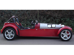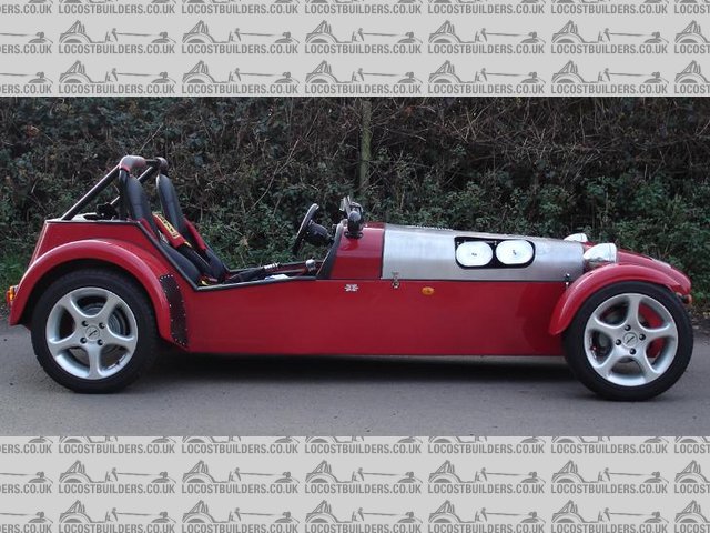
Not criticising but
balidey - 13/4/10 at 02:35 PM
New logo looks great, but there was something bugging me about it.
Its a 2D side view, with perspective.
Two seats, one infront of the other, two headlamps, two roll bar stays.
So 10 seconds with good old MS Paint...

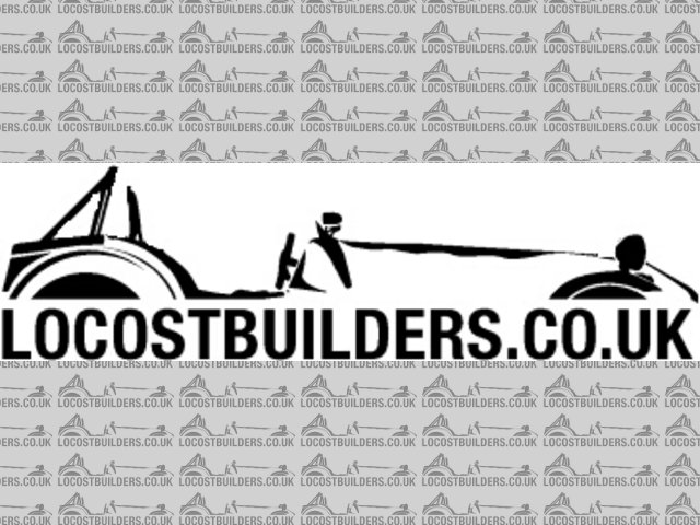
logo slight edit
And I'll repeat, its NOT a criticism on the original, just pointing out something that didn't look right to me.
eddie99 - 13/4/10 at 02:37 PM
Glad i wasn't the only one to spot that  Bugged me a bit, or what about turning the car around slightly to make it 3d?
boggle - 13/4/10 at 02:39 PM
i think it needs flames
Doofus - 13/4/10 at 02:41 PM
It's a Caterham too.
Thought this was Locost builders...
balidey - 13/4/10 at 02:43 PM
quote:
Originally posted by boggle
i think it needs flames

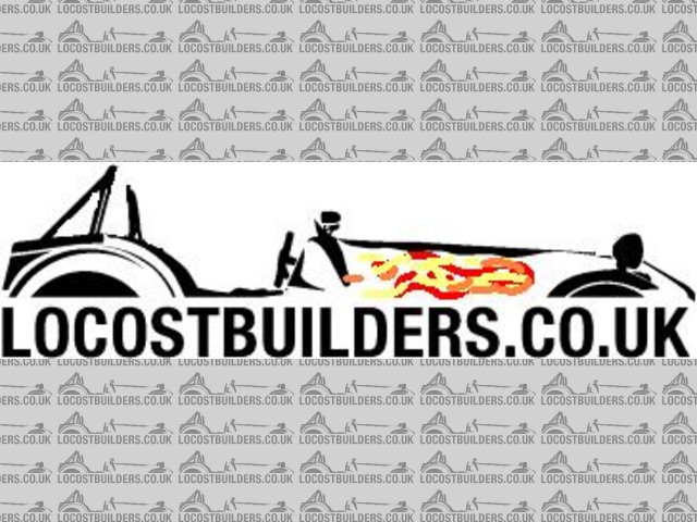
Description
Can you tell its a slow day at work today?
[Edited on 13/4/10 by balidey]
BenB - 13/4/10 at 02:43 PM
I agree- I think the single side on view looks better than the shadow lights + seat effect.
A1 - 13/4/10 at 02:46 PM
i like the flames! 
snakebelly - 13/4/10 at 02:50 PM
i like your version better also, not sure about the flames though...
Daddylonglegs - 13/4/10 at 02:51 PM
3D 
or not 
Don't mind really.....still better than the old one 
balidey - 13/4/10 at 02:56 PM
And who puts their rear view mirror INFRONT of their aeroscreen?
locostbuyer83 - 13/4/10 at 02:59 PM
quote:
Originally posted by snakebelly
i like your version better also, not sure about the flames though...
agreed, nice attempt in mspaint guys
graememk - 13/4/10 at 03:03 PM
quote:
Originally posted by balidey
And who puts their rear view mirror INFRONT of their aeroscreen?
Caterham......
boggle - 13/4/10 at 03:03 PM
quote:
Originally posted by balidey
quote:
Originally posted by boggle
i think it needs flames


Description
Can you tell its a slow day at work today?
[Edited on 13/4/10 by balidey]
hehe
it looks like he has a slight carb backfire isue
skinned knuckles - 13/4/10 at 03:21 PM
actually, i like the current one just fine. if you stood side on to a 7, that is what you would see. similar to standing at the top of a tree lined
avenue and looking down. you dont just see one tree on either side, you see all the trees that run the length of said avenue. i believe its called
perspective? if you wanted a view of a 7 sliced in half your modified one would be right.
i say keep it as it is, nice work whoever designed it
ChrisW - 13/4/10 at 03:25 PM
quote:
Originally posted by skinned knuckles
....nice work whoever designed it
See here: http://www.locostbuilders.co.uk/viewthread.php?tid=133987
Chris
kipper - 13/4/10 at 04:02 PM
will there be stickers? They would be handy for Identifying members at shows and such,  .
.
Denis.
sucksqueezebangblow - 13/4/10 at 04:06 PM
quote:
Originally posted by balidey
New logo looks great, but there was something bugging me about it.
Its a 2D side view, with perspective.
Two seats, one infront of the other, two headlamps, two roll bar stays.
So 10 seconds with good old MS Paint...


logo slight edit
And I'll repeat, its NOT a criticism on the original, just pointing out something that didn't look right to me.
Wow, your eyes must be a long way apart to get a flat perspective like that. When I stand that close to the side of a locost, I can see both seats and
both headlights! Must have my eyes too close together 
eddie99 - 13/4/10 at 04:10 PM
The point is, if you saw 2 headlights or 2 seats. Then you would also see a bit of the nosecone or rear panel etc.. In that pic. its a mix between
both
SeaBass - 13/4/10 at 04:16 PM
The logo is basically this image:
http://www.seriouswheels.com/pics-2008/bc/2008-Caterham-Seven-Superlight-R500-Side-1280x960.jpg
Modified into a two tone logo. It's therefore a Caterham.
Not sure who did the Photoshop though.
Staple balls - 13/4/10 at 04:17 PM
I was wondering why it didn't look right (apart from being a catering van) 
Glad someone pointed it out, so I don't have to think about it.
SPYDER - 13/4/10 at 04:38 PM
I hope Caterham aren't reading this. They'll be on to their copyright solicitors before you can say Ron Champion!
ChrisW - 13/4/10 at 04:43 PM
quote:
Originally posted by SPYDER
I hope Caterham aren't reading this. They'll be on to their copyright solicitors before you can say Ron Champion!
My comments on this are in this thread:
http://www.locostbuilders.co.uk/viewthread.php?tid=133965&page=2
Now, please, let this be the last of this.
Chris
wicket - 13/4/10 at 04:48 PM
Splitting hairs here a little aren't we. I think it looks great as it is. It is a logo after all, not mean't to be a photographic image.
richardh - 13/4/10 at 06:14 PM
it would IMHO if the farthest front light was nearer the fornt of the car than the nearest one - to match the seat and roll bar
Either way its better than the last one, much more up to date
Wadders - 13/4/10 at 07:38 PM
Yeah, can't imagine anyone would be that daft! 

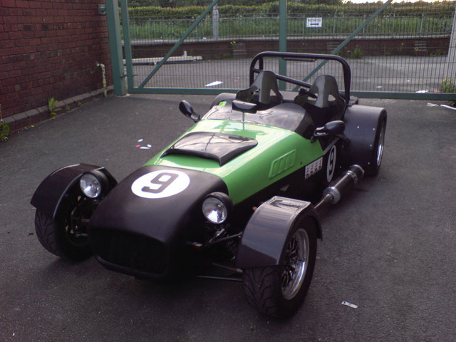
Description
Originally posted by balidey
And who puts their rear view mirror INFRONT of their aeroscreen?
balidey - 13/4/10 at 08:16 PM
Wadders, no you fitted your aeroscreens BEHIND your mirror, there is a difference 
02GF74 - 13/4/10 at 08:17 PM
who said it is 2 D? It is correct, see roll bar, seats headlamps etc.
see below.


sdie view
balidey - 13/4/10 at 08:38 PM
I am a vehicle designer by trade. I spend my working life doing 2D side on views of vehicles. The 3D software I use (SolidWorks) even has a
'perspective' button so you can add it to your model views. And maybe because of all this it looked a bit 'wrong' to me.
The fact some people have said it looks odd and others have said its perfect just shows that there is no right or wrong.
My 1st post was 'this is not a criticism, it just looks a bit 'odd' '. So I don't dislike it.
But my version with the flames is better. 
se7en - 13/4/10 at 09:24 PM
quote:
Originally posted by Daddylonglegs
3D 
Are Robin Hood making a 3D? 


The new Logo looks great no matter if it is in 2D or 3D, with or without perspective.
Don't like the flames - too retro


 Bugged me a bit, or what about turning the car around slightly to make it 3d?


