RazMan
|
| posted on 31/1/07 at 05:52 PM |

|
|
Graphics - yes or no?
After a somewhat 'colourful' thread asking for suggestions, I have taken advice on the matter and decided to take it to the vote.
Thanks to Hammerhead for the idea of the design below and to everyone else for their design ideas .... some better than others, but all were
appreciated !! 
Let the voting commence!
 
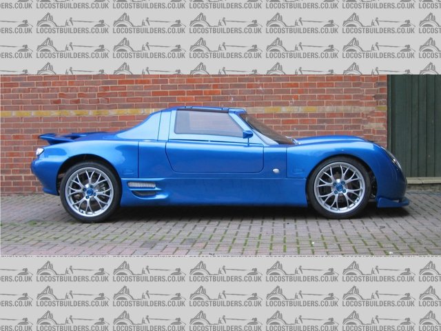
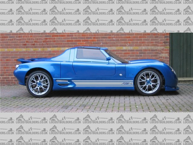
Side view for graphics
*edit* inserted plain view for comparison as suggested
[Edited on 31-1-07 by RazMan]
 
Rescued attachment Side view for graphics 3.jpg
Cheers,
Raz
When thinking outside the box doesn't work any more, it's time to build a new box
|
|
|
|
|
nib1980
|
| posted on 31/1/07 at 05:56 PM |

|
|
yes from me
|
|
|
ayoungman
|
| posted on 31/1/07 at 06:00 PM |

|
|
yes from too
"just like that !"
|
|
|
MattCraneCustoms
|
| posted on 31/1/07 at 06:03 PM |

|
|
No from me . . when you start introducing too much stuff into the mix its gonna go wrong - none of the supercars have any graphics, so I think it will
just end up reducing professionalism of the finished article. I think its a great car as it is, and it would be a shame to ruin it.
Regards
Matt
|
|
|
stevec
|
| posted on 31/1/07 at 06:03 PM |

|
|
Yep, And maybe a small one behind the B pillar.
Steve,
|
|
|
big_wasa
|
| posted on 31/1/07 at 06:03 PM |

|
|
Would have said no, but that is a very nice touch 
|
|
|
PAUL FISHER
|
| posted on 31/1/07 at 06:09 PM |

|
|
Go for it,looks good to me
|
|
|
Humbug
|
| posted on 31/1/07 at 06:10 PM |

|
|
Flicking between with and without, it does make it look a bit less slabby... I would make the blue thin stripes and the lettering a bit thicker,
though.
|
|
|
Confused but excited.
|
| posted on 31/1/07 at 06:18 PM |

|
|
Yes, if as the pic.
Tell them about the bent treacle edges!
|
|
|
jonno
|
| posted on 31/1/07 at 06:19 PM |

|
|
I like it, but its your car and up to you really 
|
|
|
David Jenkins
|
| posted on 31/1/07 at 06:21 PM |

|
|
No, for me.
I saw this car in the flesh prior to its paint job, and it is very compact - the photos make it look bigger than it is. I don't believe that it
needs any trim.
Just my opinion, of course...
David
|
|
|
cossiebri
|
| posted on 31/1/07 at 06:21 PM |

|
|
Yep, go for it 
looks good

If it doesn't fit MODIFY it!!
Cheers BriF
|
|
|
ecosse
|
| posted on 31/1/07 at 06:34 PM |

|
|
I prefer it with the Graphics
Cheers
Alex
|
|
|
Danozeman
|
| posted on 31/1/07 at 06:42 PM |

|
|
No for me. Looks perfect as it is.
Maybe change mind if they were a darker colour so more subtle..
Dan
Built the purple peril!! Let the modifications begin!!
http://www.eastangliankitcars.co.uk
|
|
|
nick205
|
| posted on 31/1/07 at 07:13 PM |

|
|
NO from me!
I think it would detract from the clean taught lines of the car and make it look less classy. As mentioned in other threads, I love the car and
particularly the colour.
Please don't do it Raz!
|
|
|
BenB
|
| posted on 31/1/07 at 07:14 PM |

|
|
I say yes!- makes the side looks less like slabs of GRP as mentioned...
|
|
|
scoobyis2cool
|
| posted on 31/1/07 at 07:44 PM |

|
|
I think that looks awesome, really suits the car.
That's a yes by the way 
Pete
EDIT: Just one thing, would it be possible to see that picture without the graphics, so we can have a side-by-side comparison?
[Edited on 31/1/07 by scoobyis2cool]
It's not that I'm lazy, it's that I just don't care...
|
|
|
Kelvin
|
| posted on 31/1/07 at 08:01 PM |

|
|
Voted yes and seeing as it'll probably only be vinyls (?) they can be easily removed if the effect is not pleasing to the eye, as long as the
preparation is correct, with ease.
|
|
|
macnab
|
| posted on 31/1/07 at 08:13 PM |

|
|
I posted yes! he he
As others have said though, anything more and you'd spoil your beautiful car.
|
|
|
907
|
| posted on 31/1/07 at 08:48 PM |

|
|
I've voted no.
Far nicer are the areas where the light catches.
These change as the viewing angle changes.
Paul G
|
|
|
pathfinder
|
| posted on 31/1/07 at 09:32 PM |

|
|
quote:
Originally posted by MattCraneCustoms
No from me . . when you start introducing too much stuff into the mix its gonna go wrong - none of the supercars have any graphics, so I think it will
just end up reducing professionalism of the finished article. I think its a great car as it is, and it would be a shame to ruin it.
Regards
Matt
new GT40?
i recon the graphics look good
|
|
|
Stuart Walker
|
| posted on 31/1/07 at 09:40 PM |

|
|
I was ready to say no, but looking at the design I really like it!
|
|
|
Simon
|
| posted on 31/1/07 at 09:43 PM |

|
|
I voted no, but:

ATB
Simon
|
|
|
Simon
|
| posted on 31/1/07 at 10:07 PM |

|
|
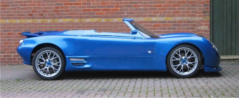
bugger, someone beat me to it, so some required mods

ATB
Simon
|
|
|
RazMan
|
| posted on 31/1/07 at 11:04 PM |

|
|
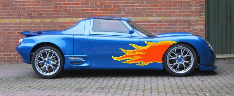
Now, I quite like that - where's my hacksaw  
Cheers,
Raz
When thinking outside the box doesn't work any more, it's time to build a new box
|
|
|


