Rescued attachment Resize of DSCF0056.JPG

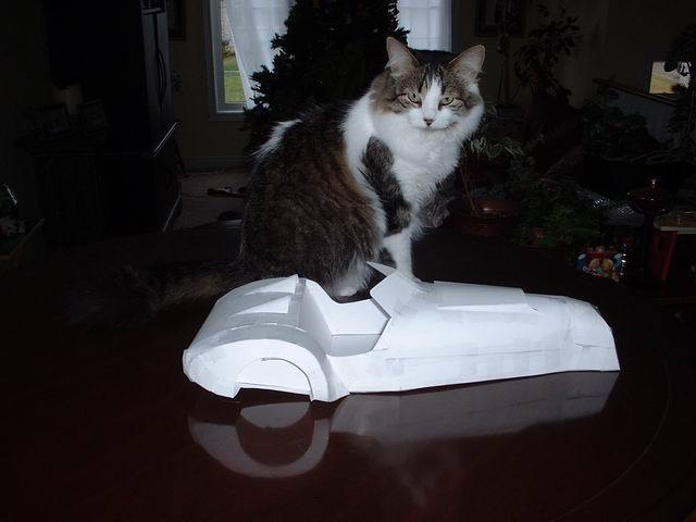
While going over different drawings on changing the rear of my build I have built up a scale modle of my chassis with a skin on it , the front is very
rough as its hard to do complex curves in flat paper, and I have not done the rear wings yet, I plan to build a couple of different styles and try
them on it this weekend. I will post a couple of pics of them for comparison and comments- good or bad are both welcome.
Dale
maybe this time
Rescued attachment Resize of DSCF0056.JPG
2
Rescued attachment Resize of DSCF0047.JPG
I like the split screen styling!
Except for the nose (as you pointed out yourself) i think it's a CRACKER!!!!
Lovely shape and me likey split windscreen to!Lovely arse also!!!
GO FOR IT......NOW!
The cat seems to like it too!!
The ugliest thing i ever saw
some clamshell fronts and teardrop rears and you've got a pretty cool looking "classic" design. I like it!
David.
I think the nose is fine, you just have to imagine it with a curved chrome grille
quote:
Originally posted by Mark Allanson
I think the nose is fine, you just have to imagine it with a curved chrome grille
I am stuck between two looks for the front -first is like the marlin sportster aka detroit 1930's hotrod rad shroud and the second is the
masarati front style of their lemans racers of the 40s
- added a rear wing to show the ass a bit better --its roughly done but gives a visual--outside of the wing should be curved into a drop of about 3
scale inches to round things off a bit.
Dale


Rescued attachment Resize of model 001.jpg
2
Rescued attachment Resize of DSCF0006.JPG
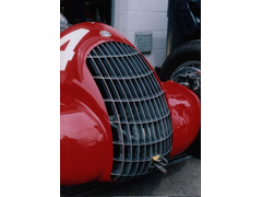
Dale, as soon as I saw the model, I thought of this, it just seemed to match hand and glove
[Edited on 11/12/04 by Mark Allanson]


Rescued attachment Grille Dale.jpg
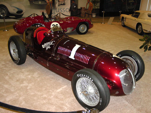
Thats one of my picks as well-- this is the most beautiful car I think I have seen and I have taken some styling from it--as well as the wheelbase,
track and power to weight if I work it right. Maserati 8ctf 1939 indy 500 winner. Unfortunatly a single seater and I require 2, but it has a very
nice front.
Dale


Rescued attachment LA_Boyle.jpg
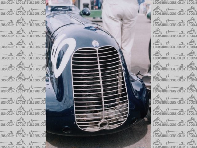
or a variant on the theme.. (I took these shots myself at Coys Historic 1999)


Rescued attachment Grille Dale2.jpg
Very nice looking. Very Blue Peter. 
I like the grill and screen especially.
Rorty, being from Canada I have never heard the term "Very Blue Peter" I am guessing its good but have never heard it before.
Dale
Blue Peter-children's program?
here's one i made earlier:
http://www.bbc.co.uk/cbbc/bluepeter/
even better:
http://www.bbc.co.uk/cult/ilove/tv/bluepeter/valpetejohn/trivia.shtml
[Edited on 13/12/04 by ned]
Are you using paper for the bodywork then? It looks like a quick alternative.  I like the shape of the old cars like the Bugatis and the old Formula
1 like Vanwall etc but I think they look better in single rather than 2 seater configuration.
quote:
Originally posted by Dale
Rorty, being from Canada I have never heard the term "Very Blue Peter" I am guessing its good but have never heard it before.
Dale
Making the grille a bit more vertical would give you a nice Bugatti look. Otherwise, I like the look of the twin narrow grilles of the original (pre
war?) BMW 320.
Cheers
KT
Very nice design. I don't think I could come anywhere near that in paper, or anything else for that matter.