sgraber
|
| posted on 11/4/06 at 11:33 PM |

|
|
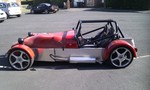
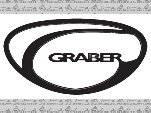
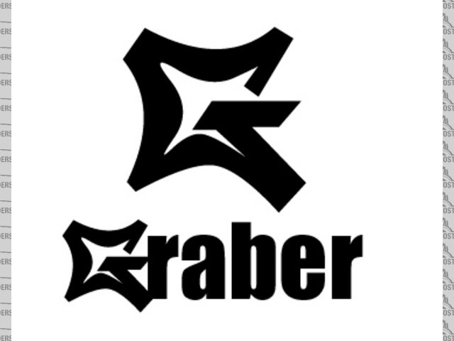
Opinions on new Grabercars logo design please
I'd like your opinion on the winner of my logo design competition. Ok, so it's the only one... But I think it's great. Would like to
hear from the crowd tho. 
 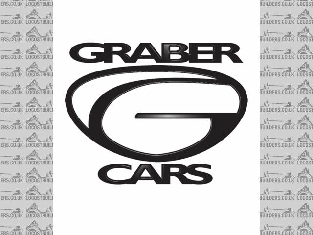
New Logo
Steve Graber
http://www.grabercars.com/
"Quickness through lightness"
|
|
|
|
|
mookaloid
|
| posted on 11/4/06 at 11:34 PM |
|
|
I like it
|
|
|
mangogrooveworkshop
|
| posted on 11/4/06 at 11:47 PM |
|
|
GOOD very good
|
|
|
Simon
|
| posted on 11/4/06 at 11:48 PM |
|
|
Like it too.
ATB
Simon
|
|
|
AdamR
|
| posted on 12/4/06 at 01:53 AM |
|
|
Good logo... simple and effective.
One little thing though (you did ask): I think the straight horizontal bar in the middle is slightly awkward - probably because the rest of the logo
is curvy. I'd consider adding a subtle curve to it and/or having less of a square end.
Feel free to disregard that advice... it's nearly 10 years since my A-level in Graphic Design and I only got a grade C.
|
|
|
RallyHarry
|
| posted on 12/4/06 at 07:07 AM |
|
|
Looks like the polylines are a bit off, like you have drawn it of a scaned hand drawing.
1.Try making it by using circles as guide, and then stretch it into the "superman shape"
2. The horizontal bar in the middle doesn't have to be that long, look at the G in the Graber word. If it's short it will be easier for
the eye to read the whole logo it into a G ( but mybe it should be hard ...)
3. Currently there's a contrast between the heavy font ant the light lines in the symbol, ease up on the kerning and take some weight of the
font and it should be GREAT.
Goood job though, it's not easy making a logo.
It should work in all ranges from a rough black&white fax print to beeing laser cut in aluminium, with all the glossy colour prints inbetween.
Good luck
Cheers
|
|
|
Hellfire
|
| posted on 12/4/06 at 07:44 AM |
|
|
I like it but I'd personally just stick with a G...
|
|
|
iscmatt
|
| posted on 12/4/06 at 08:45 AM |
|
|
i like it though as a logo i wouldn't put 'cars' underneath.
|
|
|
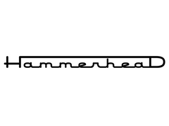
Hammerhead
|
| posted on 12/4/06 at 09:23 AM |
|
|
I agree that you should drop the 'cars' part.
Maybe integrate the name into the logo? See pic below.
I have also attached the logo for my car the 'Hammerhead'
good luck with it and keep us posted.
Rescued attachment Untitled-2 copy.jpg
|
|
|
Hammerhead
|
| posted on 12/4/06 at 09:28 AM |
|
|
my logo:
 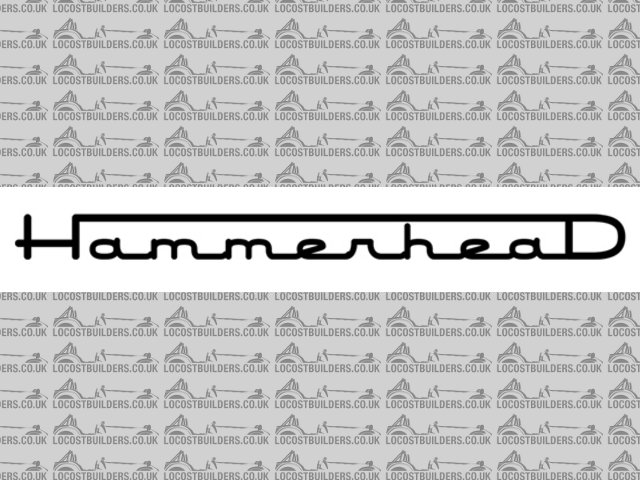
Rescued attachment logo5.jpg
|
|
|
Spyderman
|
| posted on 12/4/06 at 02:29 PM |
|
|
I like it!
I think the fact it looks slightly right side heavy is good as it makes it unique and instantly recognisable.
Keep it as is! 
Spyderman
|
|
|
Alan B
|
| posted on 12/4/06 at 03:22 PM |
|
|
quote:
Originally posted by iscmatt
i like it though as a logo i wouldn't put 'cars' underneath.
Exactly what I was going to add...then I saw someone beat me to it....
|
|
|
sgraber
|
| posted on 12/4/06 at 04:49 PM |
|
|
Wow, great response guys. THank you.
My intention is to use the logo by itself on the front of the car. Use the words by themselves (not stacked) on the back right corner of the car and
to use the stack (as seen above) for my business cards.
I am going to try some of the suggestions you have made. Hammerhead, your idea with the graber inside the logo is neat, but I wonder if it will get
too small when reduced to the size I want on the bonnet. And it makes it a bit complicated looking. Busy.
Do you like the fact the the bottom of the G has a point, like a shield? or should it flow smoothly in an arc?
Steve Graber
http://www.grabercars.com/
"Quickness through lightness"
|
|
|
Hammerhead
|
| posted on 12/4/06 at 04:57 PM |
|
|
I like it as a shield. sort of a cross between Oakleys logo and superman!
Just had a quick play...what do you think of the one below? The G is distinctive, and could be used as the badge on the front. It would look good
machined from aluminium and polished.
If you want the font i'll send it to you.
[Edited on 12/4/06 by Hammerhead]
|
|
|
jimmyjoebob
|
| posted on 12/4/06 at 05:02 PM |
|
|
You could try simplifying a little

[Edited on 12/4/06 by jimmyjoebob]
[Edited on 12/4/06 by jimmyjoebob]
If at first you don't succeed, hide all evidence you ever tried!
|
|
|
jimmyjoebob
|
| posted on 12/4/06 at 05:04 PM |
|
|
Dammit, I still can't put in pictures! Nevermind, see my photo achive for car logo if interested.
[Edited on 12/4/06 by jimmyjoebob]
 
Or another variation on this theme
or for more detail
[Edited on 13/4/06 by jimmyjoebob]
If at first you don't succeed, hide all evidence you ever tried!
|
|
|
Hammerhead
|
| posted on 12/4/06 at 05:09 PM |
|
|
as described above
Rescued attachment Untitled-2 copy.jpg
|
|
|
Hammerhead
|
| posted on 12/4/06 at 05:15 PM |
|
|
again but with a bevel like your original.
The G kind of reminds me of a race track.
[Edited on 13/4/06 by Hammerhead]
Rescued attachment Untitled-1 copy.jpg
|
|
|
Piledhigher
|
| posted on 13/4/06 at 11:31 AM |
|
|
Steve,
How would it look to put "raber" in smaller letters sitting on the inside line of the "G" in the logo?
Cory
[Edited on 13/4/06 by Piledhigher]
[Edited on 13/4/06 by Piledhigher]
|
|
|
sgraber
|
| posted on 13/4/06 at 07:00 PM |
|
|
Excellent guys! I'll get back into this over the weekend when my workload isn't so all-consuming. Ever had one of those weeks where it
seems like at the end of the day you have more work piled on than at the beginning? 
Steve Graber
http://www.grabercars.com/
"Quickness through lightness"
|
|
|
DarrenW
|
| posted on 13/4/06 at 10:33 PM |
|
|
Sorry Steve, i hate to be twat but to be honest i dont like it. The car is awesome, slek, sexy, muscly etc etc etc. The logo needs to be something
similar. To decide if i liked it or not i didnt study it - just took a quick glance which is what most people do on such logos. It reminded me a bit
like a cross between the Superman 'S' and the Ginetta logo - both of which are a bit old. The main feedback it gave me that it is a logo
off a 15K Far Eastern sportsish car rather than a 40K + carefully engineered and precision tuned Western supercar. Does that make sense? Dont get me
wrong it is very good but the car is so much better.
I feel a bit crap that i cant give you constructive suggestion / alternative.
|
|
|
sgraber
|
| posted on 14/4/06 at 02:27 PM |
|
|
Non, No, don't apologize. You'd be suprised how little negative criticism I have received over the years. I appreciate being able to think
about the design from a totally different point of view.
Not that I even agree with you completely, but it's good to do the homework now. So... What company car or otherwise would you look at their
logo and say "Ahh, 40,000 big ones!". If you could at least point me in the right direction I would appreciate it.
Steve Graber
http://www.grabercars.com/
"Quickness through lightness"
|
|
|
sgraber
|
| posted on 28/4/06 at 12:18 AM |
|
|
How about this one?
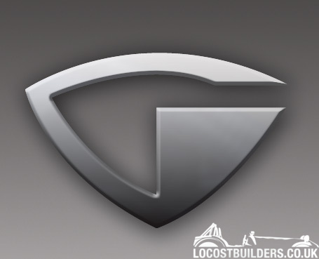
Steve Graber
http://www.grabercars.com/
"Quickness through lightness"
|
|
|
kb58
|
| posted on 28/4/06 at 01:24 AM |
|
|
Nope, no sharp corners. The corners.... "radius ratios", if that is a phrase, should match that of the body.
Mid-engine Locost - http://www.midlana.com
And the book - http://www.lulu.com/shop/kurt-bilinski/midlana/paperback/product-21330662.html
Kimini - a tube-frame, carbon shell, Honda Prelude VTEC mid-engine Mini: http://www.kimini.com
And its book -
http://www.lulu.com/shop/kurt-bilinski/kimini-how-to-design-and-build-a-mid-engine-sports-car-from-scratch/paperback/product-4858803.html
|
|
|
locost_bryan
|
| posted on 28/4/06 at 04:40 AM |
|
|
I like that last one - maybe you could shape the top of the G to match the "head rests" and roll the corners to match the fender curves
(as seen from the rear) to keep the folks happy?
Bryan Miller
Auckland NZ
Bruce McLaren - "Where's my F1 car?"
John Cooper - "In that rack of tubes, son"
|
|
|