sgraber
|
| posted on 28/4/06 at 04:11 PM |

|
|
If all goes to plan, the La Bala won't be the only car I design, build and market... I am not trying specifically to match the shape of the la
Bala.
(Is that what you were trying to get at?)
Graber
Steve Graber
http://www.grabercars.com/
"Quickness through lightness"
|
|
|
|
|
sgraber
|
| posted on 28/4/06 at 10:36 PM |
|
|
I don't know guys, I think it would be hard to improve on this one. It could be made into the head of a key too. 
I have a fullsize one of this as my desktop wallpaper and everyone that has seen it is saying it's top-notch.

Steve Graber
http://www.grabercars.com/
"Quickness through lightness"
|
|
|
DarrenW
|
| posted on 28/4/06 at 11:54 PM |
|
|
Now youre talking Steve - i like the last one. Very simple and elegant with a purposeful finish to it. By jove i think youve got it!!!!
know why i didnt like the earlier renderings now - too complicated. As Hellire said the simple 'G' says it all.
[Edited on 28/4/06 by DarrenW]
|
|
|
cita2
|
| posted on 29/4/06 at 12:58 PM |
|
|
Hi Steve,
the last design is beyond any doubt very "clean" and resembles fine art.
However I'm not too sure if it's a good car logo.
The best thing you can do is put different designs on one sheet of paper and show it to children age 10 to 15.Let them view the paper for 20 seconds
and ask them to redraw as many designs as possible without having the original.
Rearange the order of appearance to avoid "first look-first memory".
Than ask them to draw a car under every logo from which they think it resembles a sports car.
Dont be surprised by the outcome of this little test!
Those youngsters will be your customers in the near future!!
Cita.
|
|
|
RallyHarry
|
| posted on 29/4/06 at 07:40 PM |
|
|
And it should work as your company logo, keep thinking B&W prints and fax-print-quality.
Anything will look good in 3D
Cheers
|
|
|
Dutchman
|
| posted on 3/5/06 at 01:53 PM |
|
|
the last one is the best , sorth of Superman logo very efective ... I draw very similar one but in mirror for my car logo because my last neme is
Jovovic and i made it lok like J letter and like No 7 @ the same time (and if U look sideway it is also D because of my firs name Damjan/ dutchman
nickname) I was few years a graphic designer so  .... very efective I say , but I dont know will I put it on the car couse my company have different
logo for last 4years and lot of people now me like that but it is not a car bedge I do car hifi ... so I'm confused ... well I make a new
one... .... very efective I say , but I dont know will I put it on the car couse my company have different
logo for last 4years and lot of people now me like that but it is not a car bedge I do car hifi ... so I'm confused ... well I make a new
one...
company logo

the 7ish logo is like this

[Edited on 3/5/06 by Dutchman]
Tarzan English with foreign accent!
|
|
|
Hammerhead
|
| posted on 6/5/06 at 03:06 PM |
|
|
I like the last one too!! go for it!
|
|
|
xico_ze54
|
| posted on 18/5/06 at 09:59 AM |
|
|
graber logotype
quote:
Originally posted by sgraber
I'd like your opinion on the winner of my logo design competition. Ok, so it's the only one... But I think it's great. Would like to
hear from the crowd tho.
 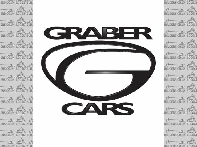
New Logo
it is not so bad as some guys said. I would mantain the original idea with some retouchs, but never present (in the car bodywork) the the lettering
joint with the logo.
I could make that retouch for free (take a look at my portfolio: http://www.viseudesign.com/portfolio.htm )
if you want contact me privately at vdesign@sapo.pt
cheers
Amadeu Pires
|
|
|
Lawnmower
|
| posted on 19/5/06 at 09:23 PM |
|
|
Cant add muc to whats ben seaid already, it all seemed very fair.
I liked the styalisd G (in 3d) the best, but as said above anything in 3d looks good. Perhaps try making them out of alluminium on a CNC machine?
I remember reading a book in shop. All that was in it was different car companies logos, and it gave the reason behind them too.
For example, BMW a blue and white quadranted circle, based on the colours of the Bavarian flag (not an aeroplane prop as i once thought).
Ty this link
http://www.amazon.co.uk/exec/obidos/ASIN/1858942756/qid=1148073840/sr=8-1/ref=sr_8_xs_ap_i1_xgl/203-0734933-1498366
[Edited on 19/5/06 by Lawnmower]
|
|
|